Richard approached me earlier this year when he was in the early planning stages of taking his weekend hustle to the next level. His fishing charter business was growing sufficiently that it was time to formalize things. For him, that meant getting himself a logo. We started the adventure with an intake survey. I do this with all new clients, and it usually serves as the key document to inform initial design concepts. I ask a dozen or so basic questions about the business, including what stage you’re in, what your goals are for the future, and whether you have any visual inspiration. Where did your idea come from, and so forth? Given that we live on an Island and there are a multitude of fishing charters around, I knew that it was going to be extremely important to do in-depth market research. When there are so many fish in the sea, how do we truly set our hooks into your audience and reel them in? Creating a visual identity that felt familiar, welcoming and friendly while also setting itself apart from every other charter business out there was going to be a challenge. It is tough to design anything fishing related without immediately jumping right into the fish hook and jumping fish imagery…Yes. I know that’s how this particular project ended up, but trust me, it was the absolute right thing to do in this case.
In my branding intake survey, I ask clients a series of questions about their business, their role, what they do, and what sets them apart from competitors. These questions are the basis for future brand positioning. Aside from the usual questions about the target market and goals for the future, I also inquire about unique origin stories and inspiration for the business. Where did your idea come from? Followed by questions that are specific to visuals, for example, “Are there any colours that you absolutely don’t want to use?” I ask them to provide links or images of brands whose look and feel they like, and not to limit them to their own industry. All of the insights from this survey become the groundwork for the brand identity and are where the research phase truly kicks off!
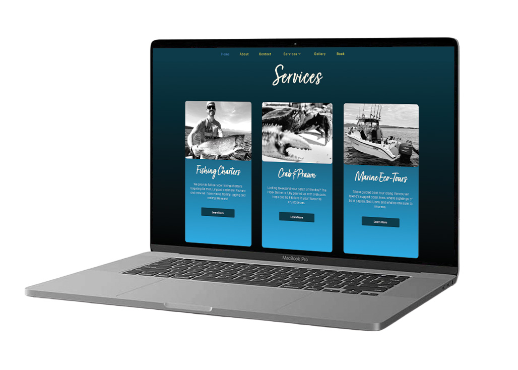
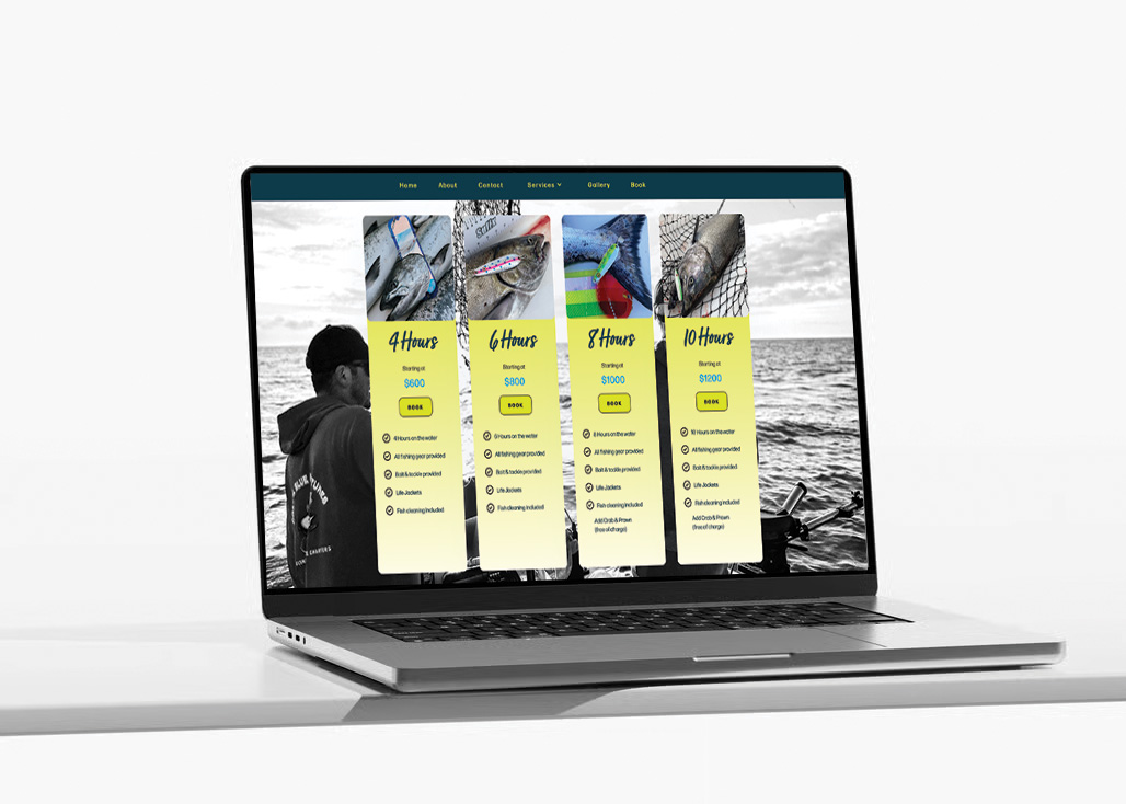
Hoek Setter Fishing Charters is a charter business that offers fishing charters, marine eco tours, and crabbing/prawning. They strive to provide customized experiences for small groups of 1-4 people, with a focus on creating fun, comfortable, and memorable days on the water. Safety is a top priority.
The goal for potential growth was to move at a comfortable and sustainable pace for the first couple of years, with a push towards full-time expansion after 5 years.
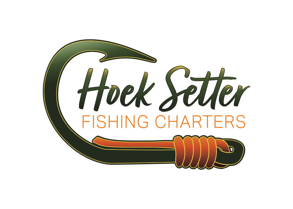
The primary demographic is families. 1-4 people who want to spend time outdoors and experience the West Coast. Richard shared his thoughts about colour choices and specific imagery that he thought could work. Typically, I tend to side-step overly obvious choices for logos. Not to be subversive, but in service of creating meaningful imagery. This project is not one of those cases. Why did I make an exception this time? Because using a fish hook for this logo does two things: Tells you immediately that this business is for fishing, and gently guides you into the correct pronunciation of the name! You say Hoek like Hook!
Hoek Setter is a “We” brand. The tone of voice should sound friendly, outgoing, and welcoming. The backbone of the brand is that experiences are built on a deep and well -rounded knowledge of fishing and the great outdoors. While there is underlying authority (seen in safety standards and expertise in gear, navigation and fishing), there is never an overtone of superiority or impatience. Hoek Setter thrives in a space where newbies are welcome, and likely the majority of the clientele. So a tone that feels inclusive, happy and natural is important. The voice of the brand is that of a friend who is sharing their passion with you. It’s not a secret club - moreover, it should feel like an invitation to grow as an outdoor enthusiast.
Hoek Setter is open and honest. They are transparent with expectations and will share knowledge along the way about where these expectations come from.
If Hoek Setter were to be personified, they would be someone who is a beacon of knowledge, safety and authentic joy. Like your favourite uncle, or a very present and loving father. Someone who you can turn to for life advice - or a good dad joke. He has a firm handshake and a warm hug. He is always dressed in cozy layers and is prepared for intermittent weather.
In writing, Hoek Setter should sound inviting yet informative. Knowledgeable, but not overly scholarly. Information shared should feel accessible and in layman's terms. Using the opportunity to share the basis of knowledge through small factoids or tidbits.
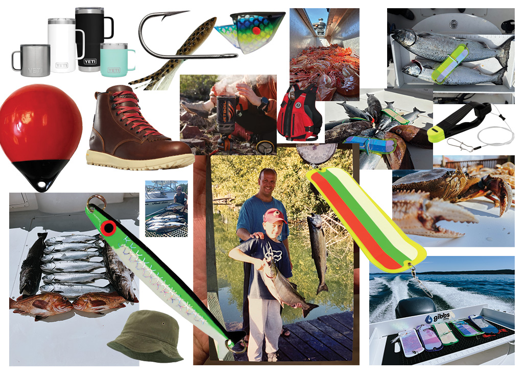
Generally, once I have this tone-of-voice and brand personification sorted out, I spend some time looking at existing brands that I feel have similar goals and audiences. I look at commonalities between these brands. What are they doing aesthetically? What type of people are engaging with their content on social media?
For Hoek Setter Fishing Charters, I was looking at outdoor brands like:
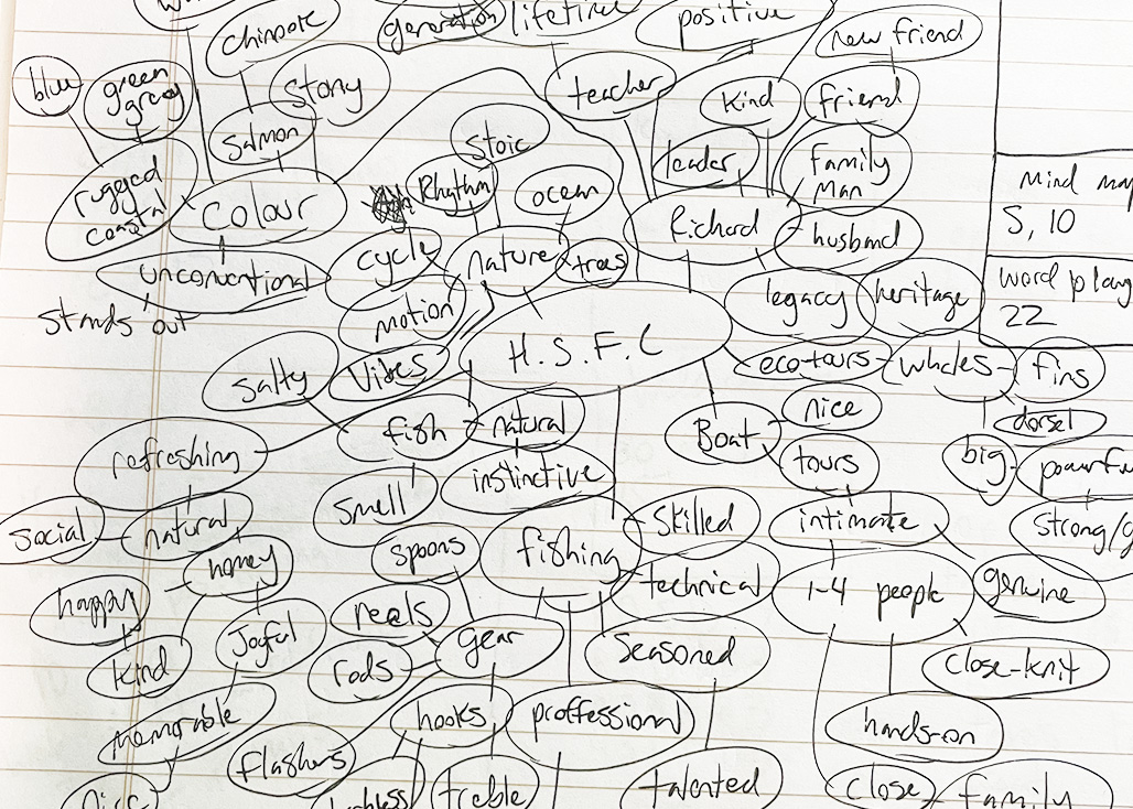
For full brand identity packages, I usually do a visual mood board like a ’90s middle schooler. It’s quick and dirty and feels like second nature at this point. Before I hop into visual exploration, though, I always do what’s called a “mind map.” You may have even done an exercise like this before, but it’s basically a visual word cloud with phrases, words and ideas stemming from a nucleus in the middle of the page. I set a 25-minute block, and in that time, I scribble out all my first thoughts, ideas, and impressions for the brand.
At the conclusion, I take all of the words and separate them into groups of nouns, adjectives and otherwise. I look for commonalities across the groups, and these findings help to inform the identity of the brand.
Here are some of the highlights pulled from the Hoek Setter Fishing Charters mind map:
Nouns: Richard, Husband, Friend, New Friend, Teacher, Guide, Family-man, Whales, Boat, Family, Spoons, Reels, Flashers, Hooks, Shank, Treble Hook, fishing rods, ocean, fish, chinook, salmon, rugged coast, fins, lineage, Adjectives: Leader, Family-man, legacy, multi-generational, positive, heritage, strong, gentle, close-knit, hands-on, thoughtful, articulate, inviting, professional, humble, inviting, skilled, technical, instinctive, natural, salty, happy, homey, kind, joyful, memorable, social, refreshing, nice, green/grey, blue, stand-out, lifetime, lifestyle, stony, rhythmic, stoic,
From these words, I started to explore the commonalities and feelings that arise.
Themes:
Tone of voice
In my branding intake survey, I ask clients a series of questions about their business, their role, what they do, and what sets them apart from competitors. These questions are the basis for future brand positioning. Aside from the usual questions about the target market and goals for the future, I also inquire about unique origin stories and inspiration for the business. Where did your idea come from? Followed by questions that are specific to visuals, for example, “Are there any colours that you absolutely don’t want to use?” I ask them to provide links or images of brands whose look and feel they like, and not to limit them to their own industry. All of the insights from this survey become the groundwork for the brand identity and are where the research phase truly kicks off!
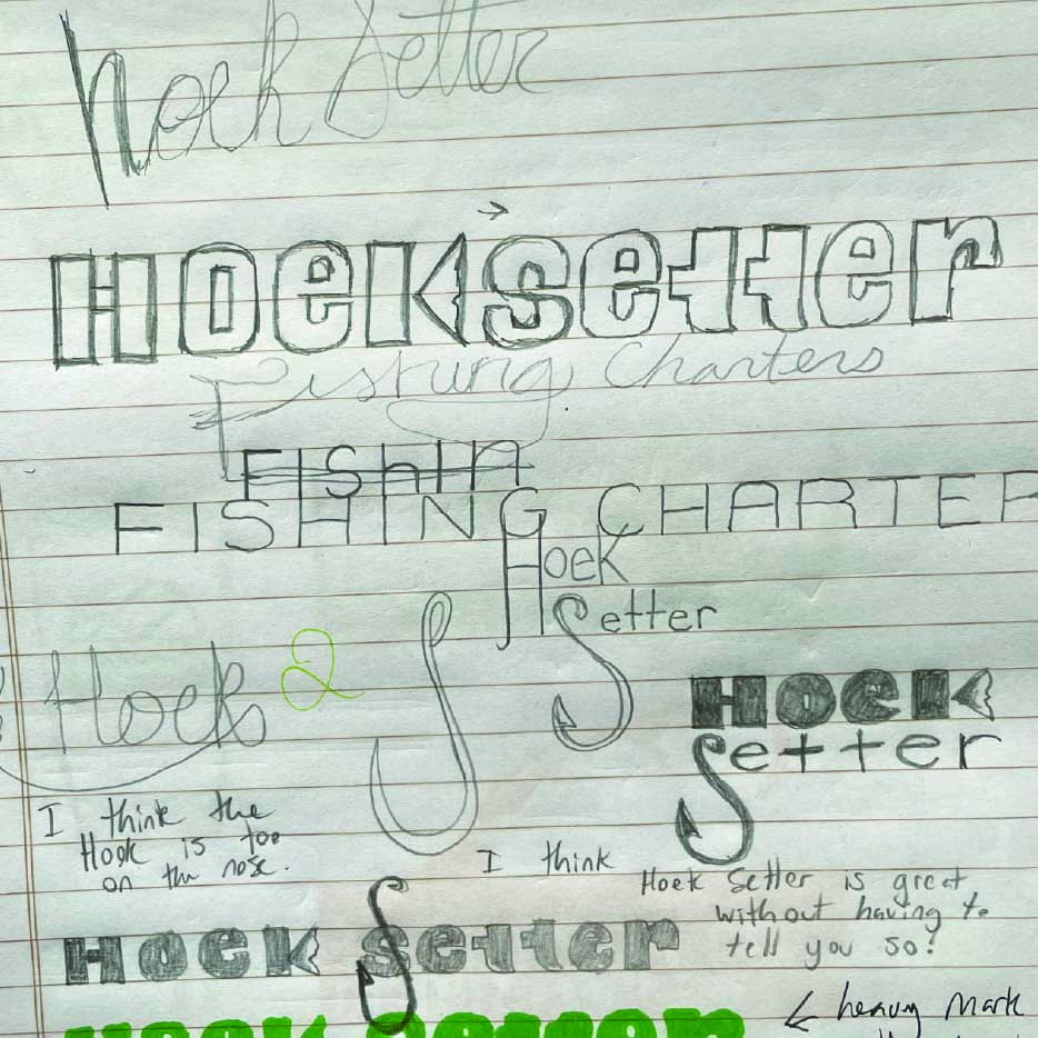
Using all of the data from my mood board, mind map, and intake survey, I get to work on sketching logo concepts. These scribbles help to work out ideas and composition for the logo. The first concept that I explored for Hoek Setter was a swimming chinook salmon with a blocky word mark. This concept didn't make the cut with the client, so I explored more traditional imagery (Fish hooks). After pitching the first logo concept, Richard expressed that he had always envisioned his logo as a fishhook. Fair enough, sometimes it takes looking at other designs and ideas to set in stone what exactly feels right (or wrong).
I got to work learning more about salmon fishing gear, hook shapes, lures and the purpose of each style. I landed on a 5/0 open eye siwash hook. The hook features a nice, rounded hook shape, with a flat shank and a very sharp-looking barb at the point. This shape would lend itself perfectly to a design with a nested word mark. My first sketches didn't include any fishing line on the hook; I found that it looked a little empty and lacked balance in the design. I added a few loops of line around the shank, which filled the negative space nicely.
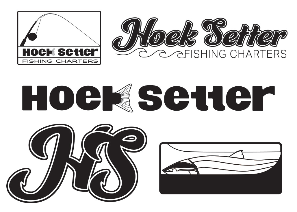
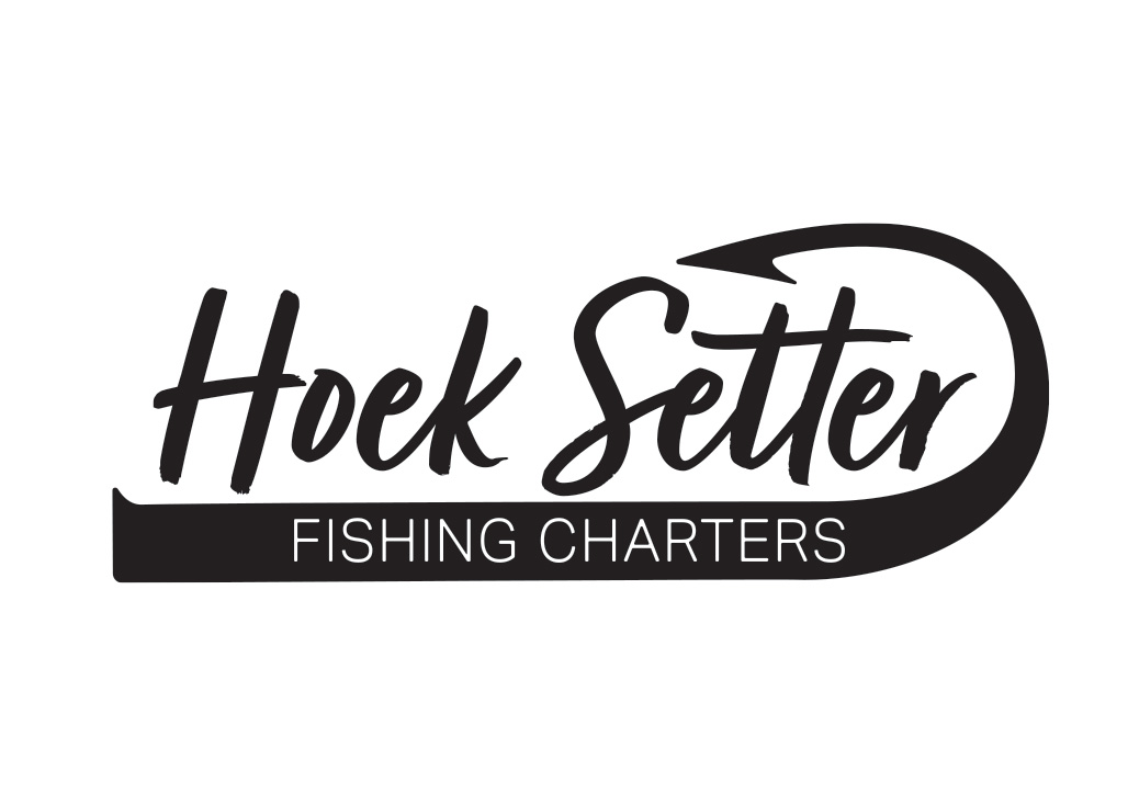
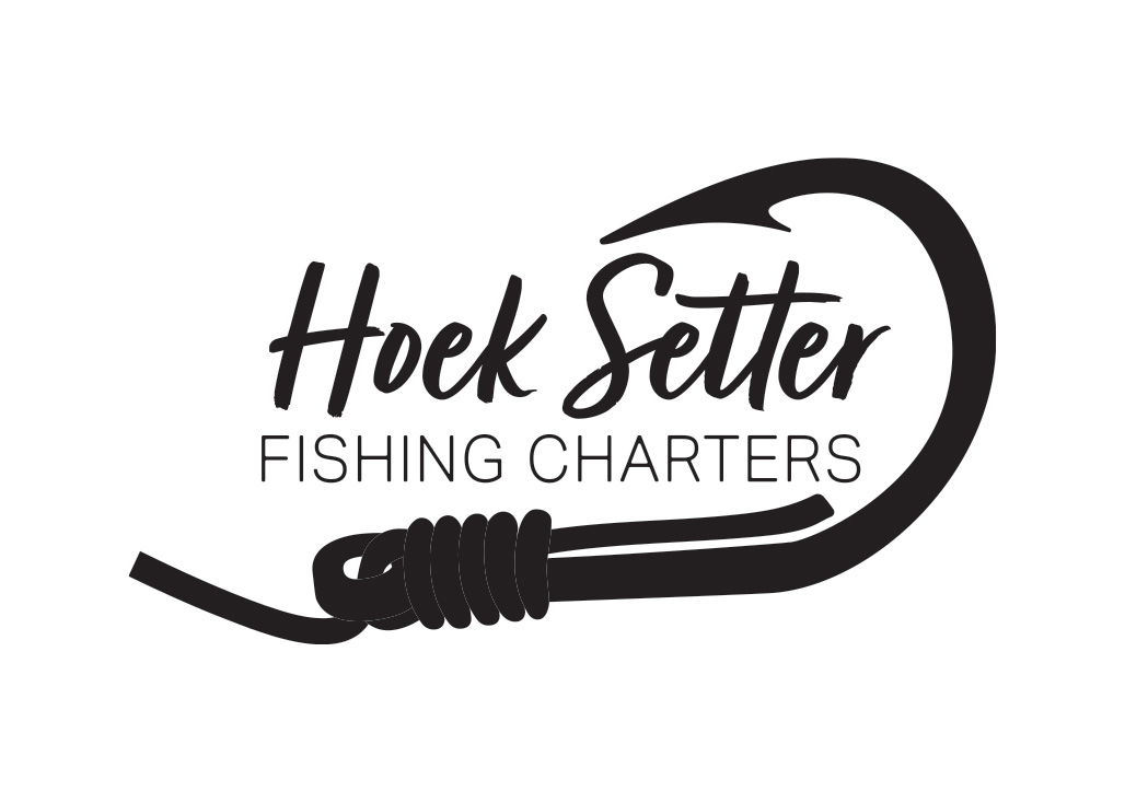
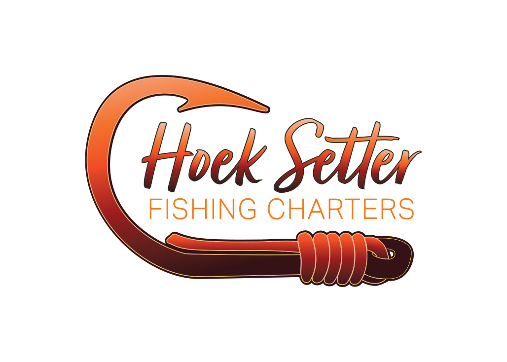
In my first concept for the logo I leaned into using somewhat unconventional colours. Shades of burnt orange, red and a pale salmon pink. I wanted to test out this palette for the revised concept. They truly missed the mark. There is something just not quite right about an orange fish hook. I jumped to another set of colours with a sage green, and rusty red. Still not right. There was a glaring sign that this brand, with it's roots in tradtion and fishing culture would do best to rely on the classic colour palette for ocean-based activities. Blue is the name of the game.
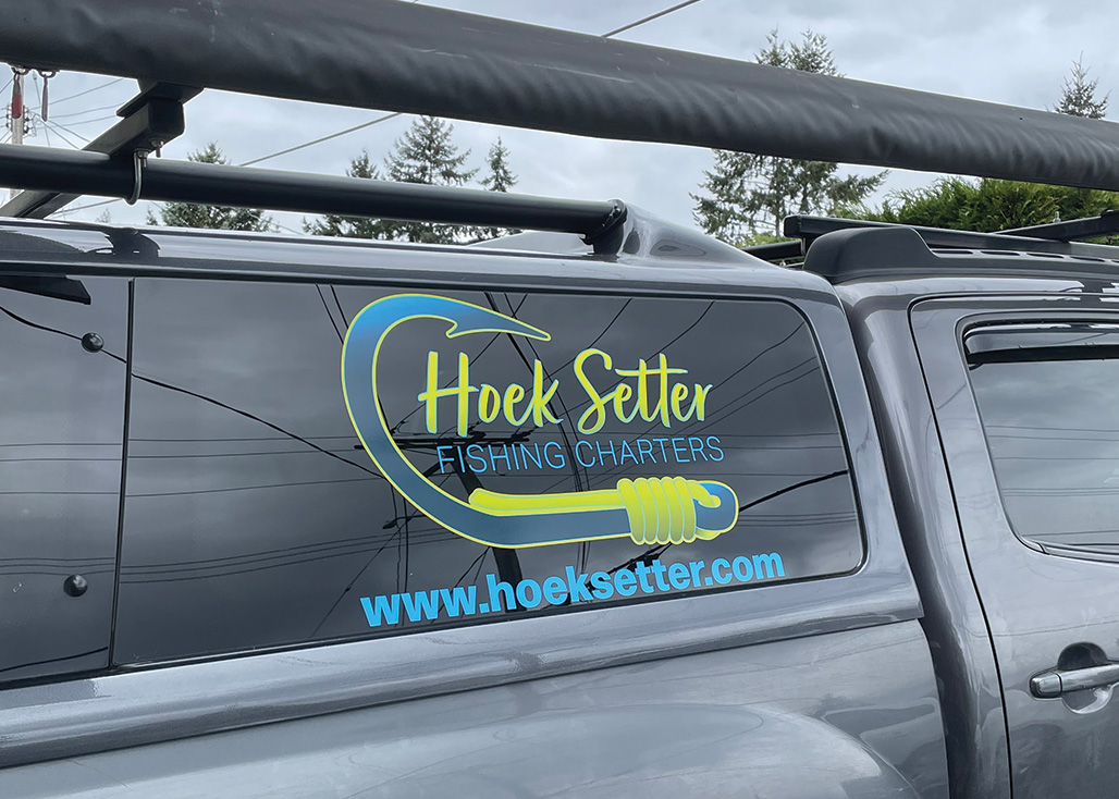
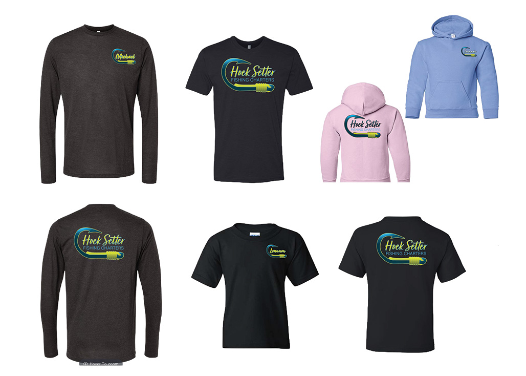
The Hoek Setter Fishing Charters brand identity was a project that encouraged me to play in the safe zone, while still building a brand that spoke volumes. A gentle reminder that subversive is not always the answer. Some businesses need the clarity that comes with convention. This brand is a prime example. Yes, it is a fishing charter company with a fish hook as a logo, but that hook is the product of articulate research, hand sketches, colour theory, and brand positioning. The Hoek Setter hook is the emblem for a family business, worn proudly on hats, hoodies and stickers. The boat and trucks are decked out in big decals, and the website ties it all together. It’s like a tried and true lure. There is a reason why the same gear your granddad fished still slays salmon today - because it works!

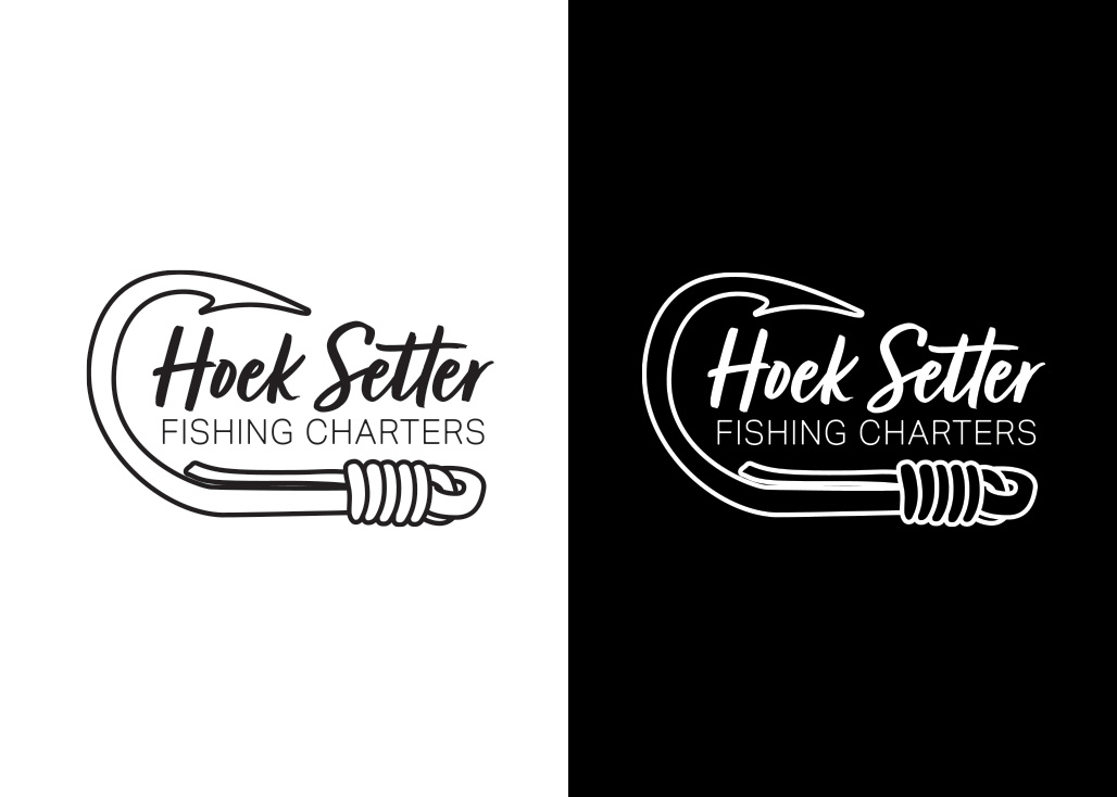
The final output of this logo was destined for apparel and swag. With that in mind it was imperative to create a solid set of monochromatic logos for the suite. So we have the solid black, and solid white versions.
As a design student, I always loved the colour theory portion of lectures. A place to assign meaning to the mundane. Colour is as much anthropology as it is aesthetics. I love that. Colours carry cultural significance, power, emotion and history. It’s often the first thing we notice in a good logo. How colour makes us feel can be the difference between liking something or not. For example, Richard “not being an orange guy” led us into the logo concept that we have today! I’m so glad he said something. Now, why did I choose this specific colour palette?
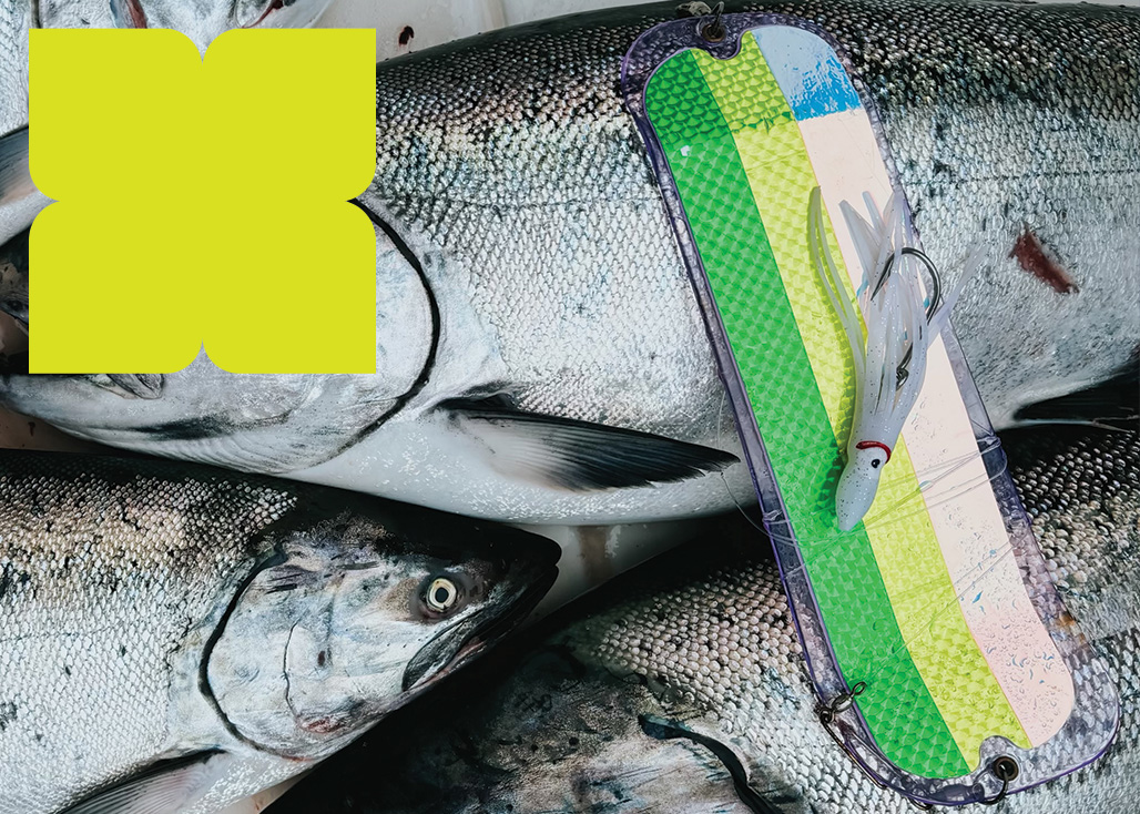
There are 5 core colours in the Hoek Setter swatch. These colours are inspired directly by popular salmon fishing gear, actual fish, and, of course, the ocean. These are colours that fishermen know and trust. There is the added benefit that they are naturally complemented by their surroundings. They look great on the ocean and against the backdrop of a sunny day on the boat. I gave each of the colours a name to reflect their inspiration. I like to have a little fun sometimes :)
Roller:
This dark blue with a grey undertone is what the ocean looks like in Port Renfrew on an overcast day. It reminds me of a day I spent fishing in our old center console boat. It was windy, and the rollers were big. Our motor failed, and we essentially rode the waves back to the marina. I’ll always remember that mixture of quiet fear and marvelling at the colour of the water that day. That is just how fishing goes sometimes; it can be a mixed bag. The ocean is as beautiful as it is powerful. Just like a solid dark blue. That’s why “Roller” is the primary colour for Hoek Setter.
Electric Eel:
To complement Roller, I aimed to find a nice electric blue. I always try to build colour combos that have strong contrasts. This all comes in handy when you are designing a logo suite that will have many outputs. It’s handy to have a mix of colours that will look great on both light and dark backgrounds. Electric Eel is inspired by the light blue fishing line and a short rubber cord called a “downrigger snubber”. These little pieces of equipment are found on any serious fishing vessel and instantly recognizable.
Chartreuse:
This limey yellow green has been used in fishing gear for as long as anyone can remember. A Chartreuse flasher always gets the job done out on the West Coast. Just walk into a tackle shop, and you’ll be mesmerized by the wall-to-wall glare of chartreuse. Fish love it, and so do we.
Brownling:
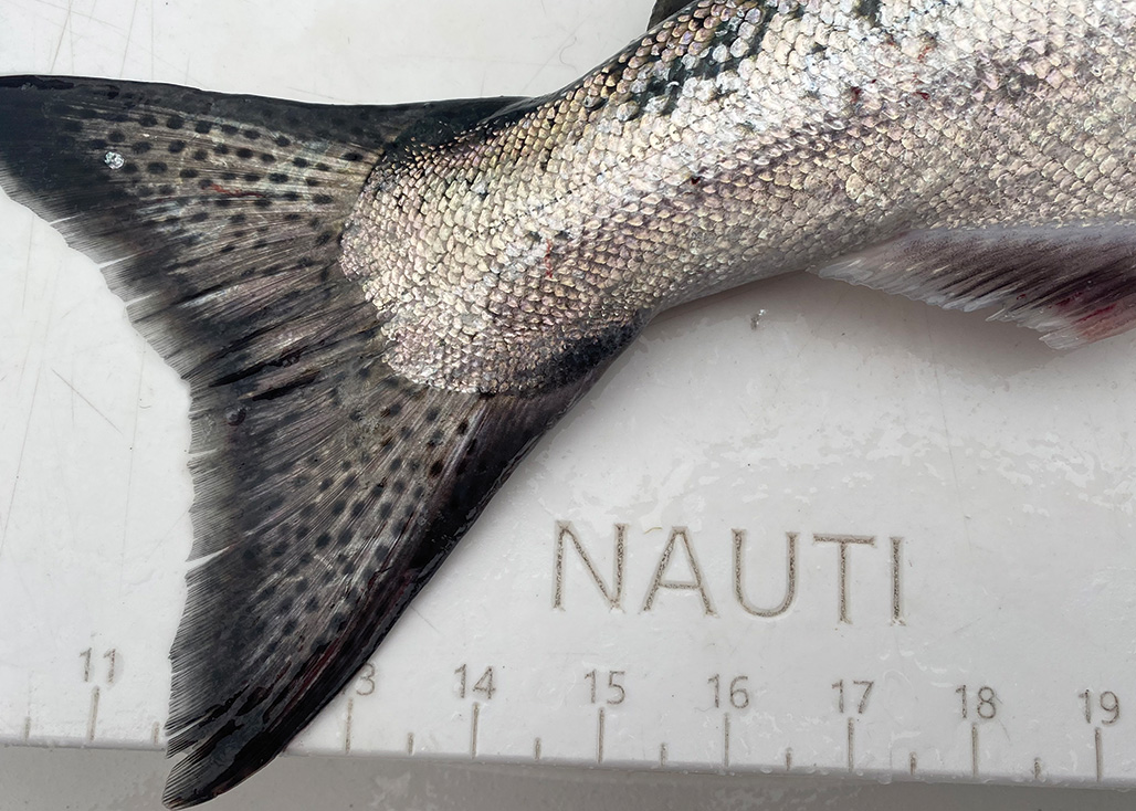
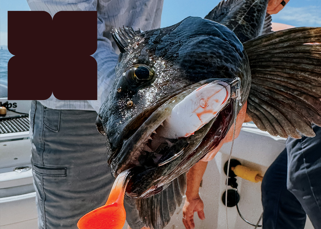
Have you ever seen a lingcod? These toothy, spikey fish have the most amazing colour and patterns. In some light, they almost look like leopard print. Spackled with dark brown and black dapples, they are a designer's dream. I pulled the colour sample for brownling directly from one of Richard's Ling cod photos.
Butter:
To balance some of the darker shades out, I included an off-white “butter” colour. This creamy shade is from the same spectrum as chartreuse, all the way to the whiter side. Butter is also the ultimate companion to cooking prawns and crab. An easy choice to round out the colour palette for Hoek Setter Fishing Charters.
Arguably, the most important part of a logo is the wordmark. This is how you know what you're looking at! For Hoek Setter, there were a few factors that needed to be part of my typography considerations. It would need to be legible at a distance, and at various sizes. The main wordmark would be displayed on the side of a boat, on business cards and on clothing. With all of these considerations at play, I’d need to choose something that wouldn’t be problematic for a screenprinter or embroidery machine. I still also wanted to adhere to the underlying values of a friendly, happy, bold legacy. Not too many frills or loops, but something with some handwritten character for the main wordmark, and then something balanced and clean for the subhead.
Hoek Setter:
I found the perfect candidate in “Turbinado.” This classic brush script is energetic, slightly playful and above all highly legible. In its original form, it is a bit on the dainty side, but with some beefing up and rounding of all the pointy bits, it was a perfect match. I went in and manually deleted a bunch of jagged edges and extra points, knowing that these do not translate well to embroidery and cutting machines. With a little TLC and care in spacing and line weight, Turbinado was exactly the right choice. Hoek, line & sinker.
Fishing Charters:
For the subtitle “Fishing Charters,” I was looking for something with equal letter height across the board. This straight line of text would serve as an anchor for the main word mark. Having a solid block for “Hoek Setter” to sit on top of would ensure that the upper text always looks level. This is important because when an installer goes to put decals on a vehicle (or boat), there is a built-in straight line, which eliminates the guesswork when you are lining things up. The same principle goes for grid layouts in newspapers, and all the way across to web design. A good logo has to be made from all angles! That is why I chose the tried and true “Aktiv Grotesk”, it is bold, rigidly straight and behaves well when it is wearing a scripty wordmark as a hat! I gave it the start treatment, adding a touch of extra weight and softening some pointy edges. “Pinching the barbs,” if we really want to use another fishing analogy.
The deliverables for this project created a beautiful umbrella of branded goodies from the logo itself to stickers, apparel and of course a great big website!
This logo suite is comprised of a primary logo, light colour alternate logo and b&w versions. Each with it's own set of use cases.
The branded assets component of this project was that part that ties everything together and put a nice bow on everything. To round out the project I designed:
The website was the largest and most integral part of this project. It would be most of the heavy-lifting for the business, serving as the first point of contact for customers, and the hub for sharing all information about Hoek Setter Fishing Charters. The site includes:
Included in this web design package was the setup of a proprietary email address and a Google Business Listing.
Take the website for a spin (HERE)
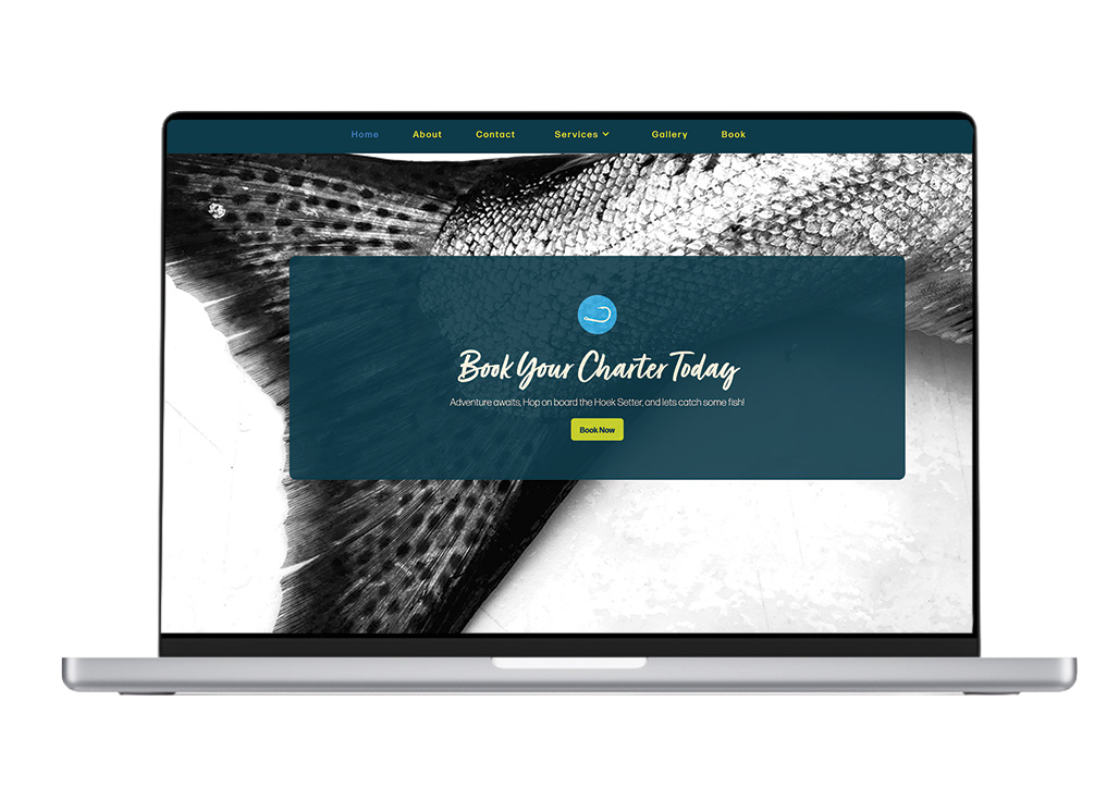
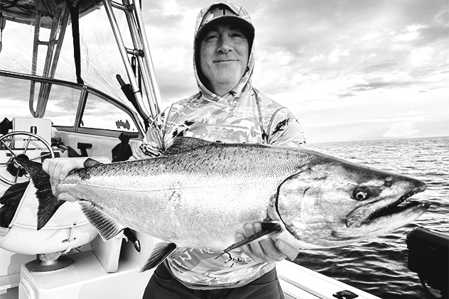
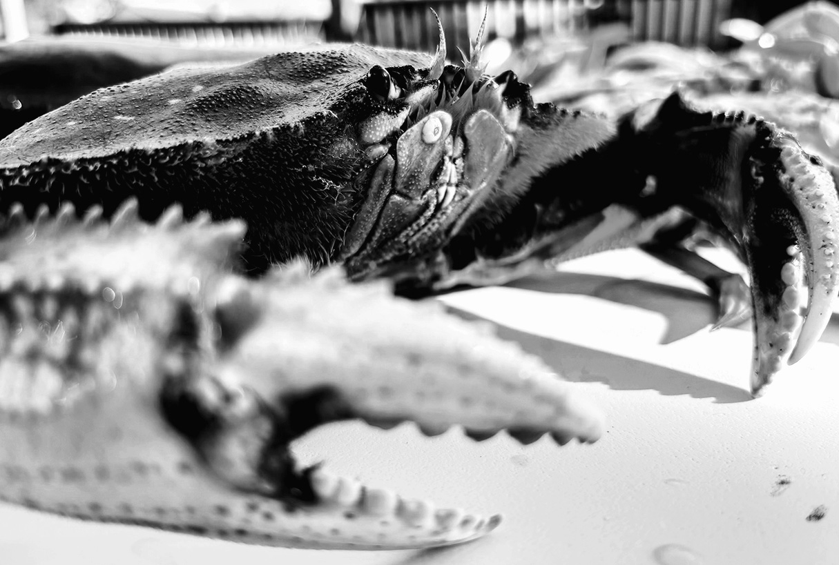
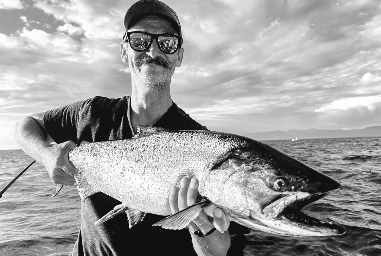
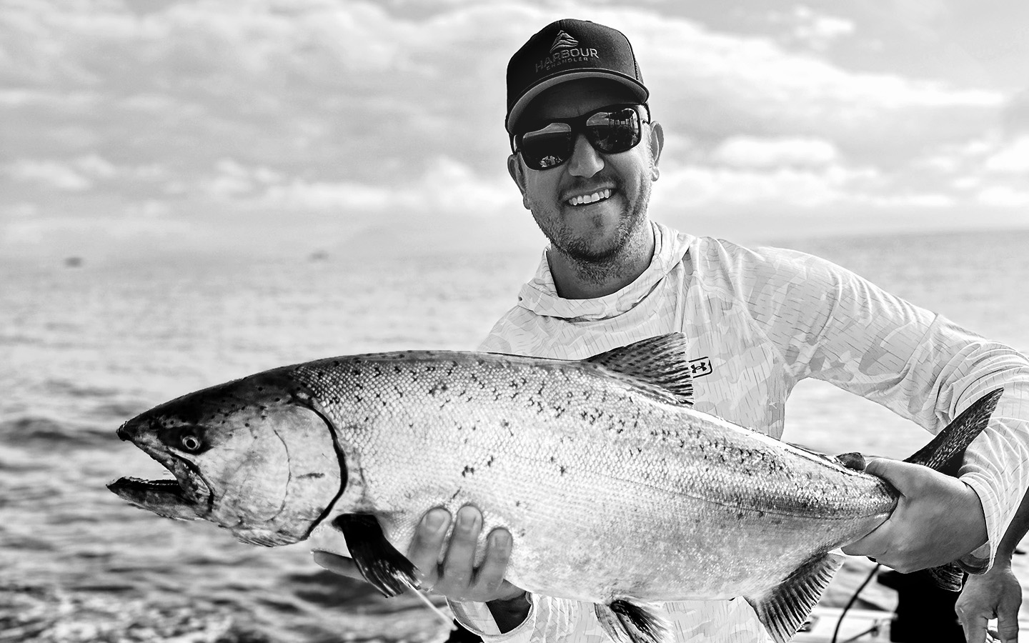
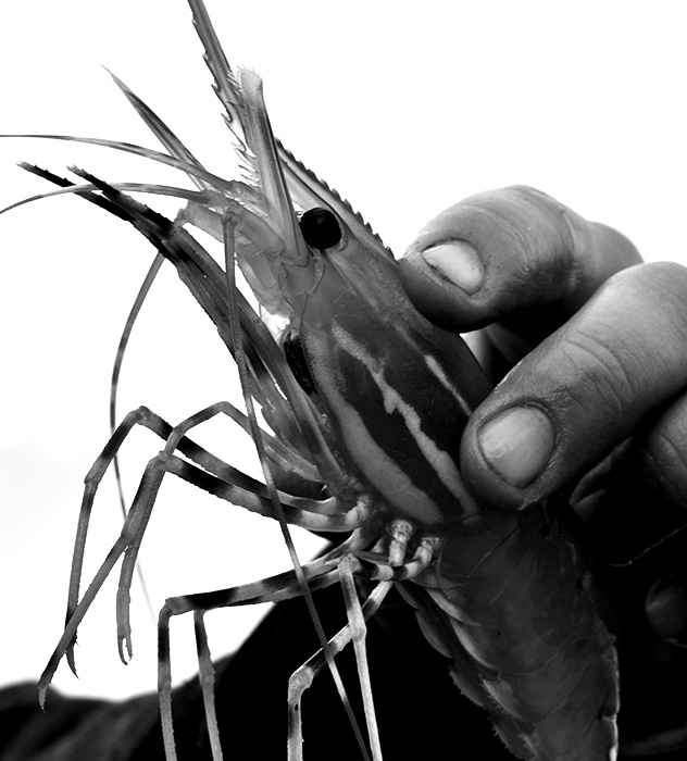
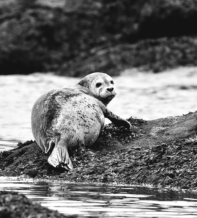
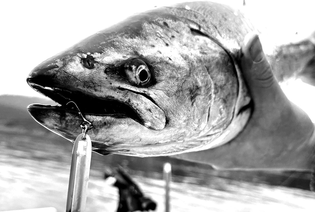
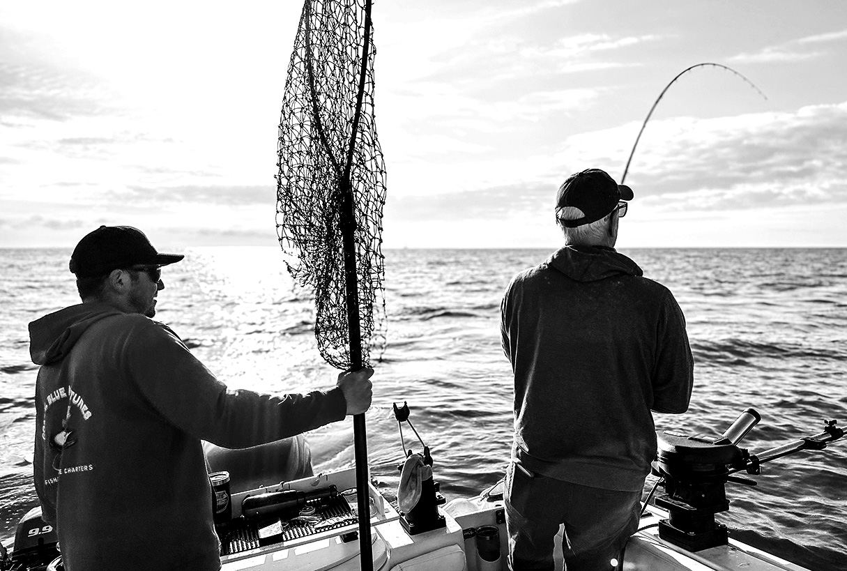
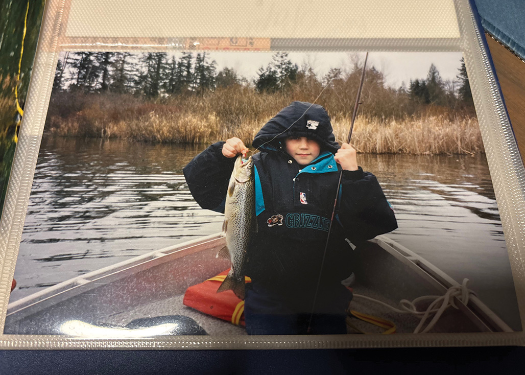
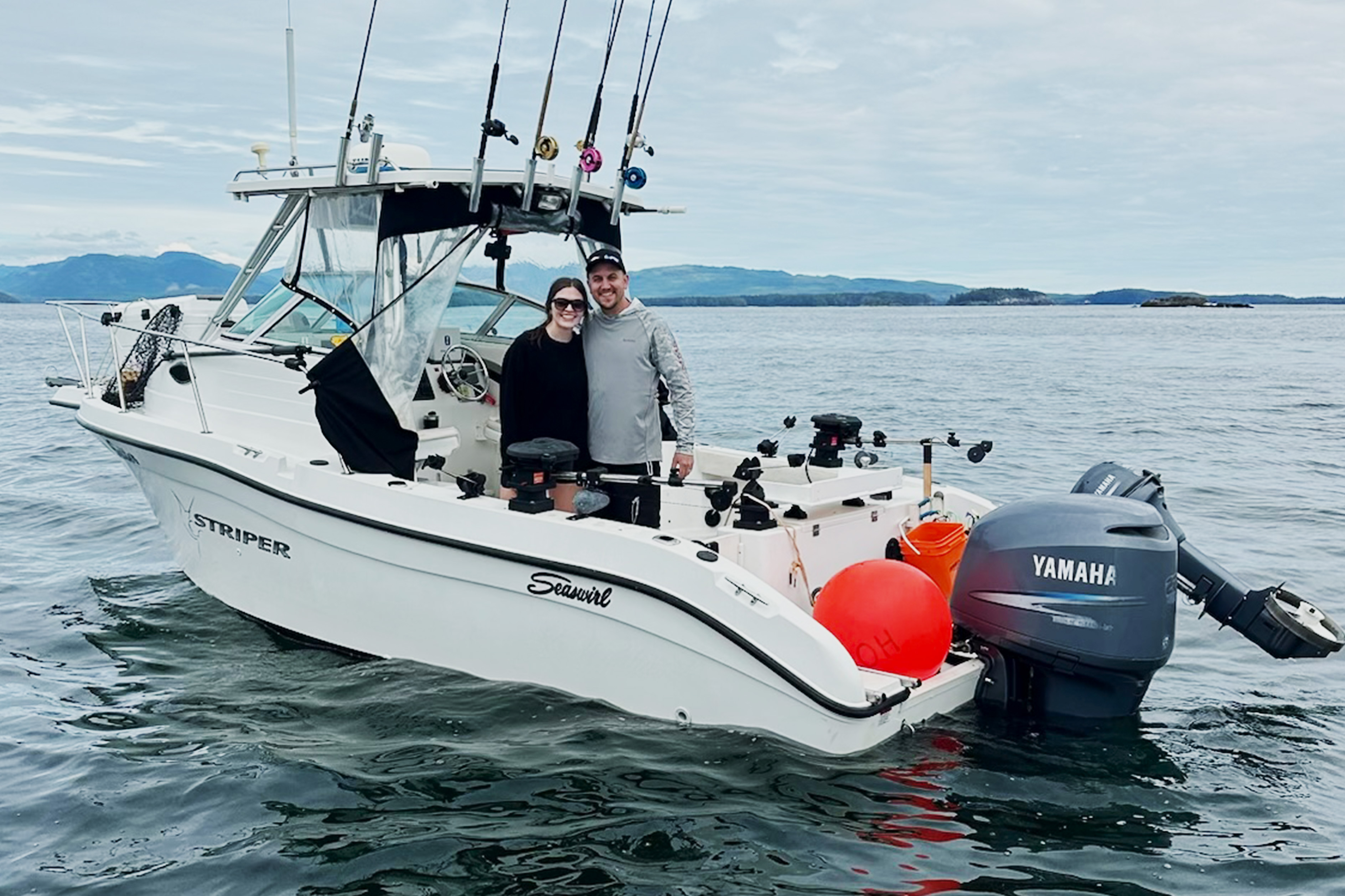
Fishing as a recreational sport is naturally very “image heavy”. You would be hard pressed to find a website or magazine about fishing that didn’t include an abundance of “grip & grin”. As part of the brand identity, I needed to find a way to include catch of the day photos that felt unique, inspiring and ultimately sell the experience of a day on the water. Richard provided me with a massive cache of great pictures to use. So quantity certainly was not an issue. The main challenge was going to be in making these images feel cohesive, match the tone of the rest of the brand and fit the bill of a timeless, welcoming and inclusive brand. My first instinct was to overlay images with a transparent layer of blue. While it looked cool, it wasn’t quite what I was looking for. I wanted the imagery to feel classic. What is more classic than black & white! I brought the images into Photoshop, where I created a crisp black-and-white filter. I adjusted the levels so that I had nice hard contrasts of cool white and very black blacks. I wanted to preserve a lot of sharp detail, especially in the fish. I applied the filter to each of the photos, making other adjustments as needed. The custom filter ensured that all of the images matched and drove home the goals of the brand.