Robson Valley Community Services is a long-standing non-profit organization based in McBride & Valemount, BC (The Robson Valley). They provide a wealth of services to their community, including access to counselling and support, as well as childcare and food stability programs. The team from RVCS presented a proposal to me for a branding overhaul. They had recently gone through a big change in leadership and made a few tweaks to their programming and mission. With these new pieces in play, the existing branding had become somewhat outdated and no longer felt reflective of their vision for the future. We started our branding journey with a zoom meeting, where I got to know a bit more about the organization and the people who would be making decisions along the way. This project would need to meet the approval of several board members, the Executive Directors and staff. To begin the process, all team members filled out the project intake survey separately. This allowed me to gather insights from a variety of unique perspectives.
To kick off the research phase, I conducted a full brand audit. I reviewed the existing logos and supporting assets, did a deep dive on the organization's website and looked at what similar organizations within their region were doing. All of this information helps in building a concept that reflects the current mission and lays the groundwork for new visuals. One of the key concepts that the board of directors wanted to include in the new logo was imagery of fireweed. The fireweed is a local plant that blooms in areas that have gone through environmental disruption (such as forest fires). The flower is a symbol of resilience and new growth. This concept became the underlying inspiration for the logo.
To kick of this full rebrand project, I sent my branding intake survey to my project contact, who then shared it with the board of directors at RVCS. Each of them filled out the survey independantly. This was a useful way to gather broad opinions from across the organization. It was also helpful in narrowing down consistancies in the expectations of the group.
After everyone had completed the survey, we all hopped onto a zoom meeting where we discussed some of the findings, and fine-tuned what was most important to represent in the new design. Here are some of the things that floated to the top:
Robson Valley Community Services is a charitable organization dedicated to strengthening all individuals, families, and communities by providing programs and services and by collaborating within a rural environment.
The organization is rooted in community, progress, healing and support. All of these attributes would need to shine through in the branding. We wanted to create something that represented a comfortable and welcoming space.
Brand Positioning for a non-profit is not exactly the same context as it is for a commercial business. The end goal is less about being the best option, and more about creating a sense of why this organization exists. Who do they help and how do they hope these clients feel.
With those considerations in mind the brand postioning is based on values, inclusiveness and community - and not on competitor analysis.
Compassion over competition.
The mood board for this project was full of florals! fireweeds, and the peaks of the Robson Valley. It was a trip down memory lane as I gathered images that reminded me of the place I grew up. Big mountains, and green valleys full of wild flowers felt like an invitation home. I can confirm that this energy was completely poured into the visuals and storytelling for this brand.
To kick off the research phase, I conducted a full brand audit. I reviewed the existing logos and supporting assets, did a deep dive on the organization's website and looked at what similar organizations within their region were doing. All of this information helps in building a concept that reflects the current mission and lays the groundwork for new visuals. One of the key concepts that the board of directors wanted to include in the new logo was imagery of fireweed. The fireweed is a local plant that blooms in areas that have gone through environmental disruption (such as forest fires). The flower is a symbol of resilience and new growth. This concept became the underlying inspiration for the logo.
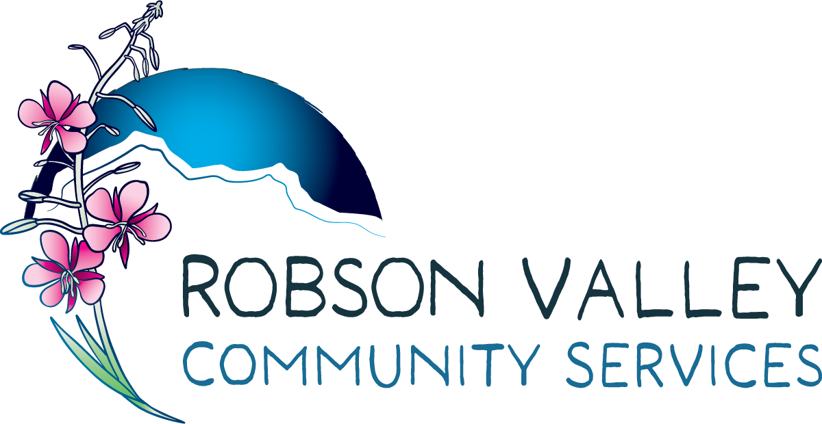
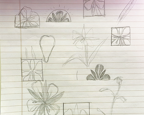
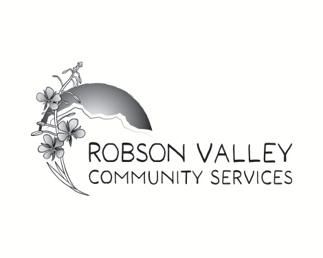
Based on the outcomes of the intake survey, and subsquent meeting with the Board of Directors, the key visual element to include in the new logo was a fireweed flower. Fireweed is a plant that grows in the aftermath of natural destruction like forest fires. The flower is naturally a great subject for a logo, it is vibrantly coloured, the petals are beautifully symetrical and the stems are long and leafy. All great features when it comes to distilling these elements into usable shapes for a logo.
My first iterations were decidedly minimalist. I reduced it down to very basic shapes and nexted it into a square icon. This concept missed the mark and ended up looking too cold. I took another stab at drawing the forms of the fireweed and ended up with something more flowy. At this point I skipped over to digital explorations and started to compose a logo to fit the bill.
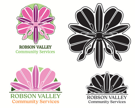
Once I was working with my logo concept in the digital realm, I was able to come up with some more comprehensive layouts. I came up with a handful of new concepts and got to work experimenting with type and colour.
For this colour palette, I knew that I wanted to pull colours directly from nature, specifically from the fireweed itself. At first I felt that the true colours of the flower were way to saturated. I wanted to tone them down substantially to convey a feeling of calm and comfort. Then just for funsies I put together some colour concepts that were way out in left field. More firey and hot, sometimes it's in the little experiments that you can truly nail down exactly what you should not do!
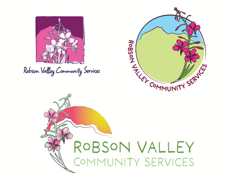
After making some changes to my first concept pitches, we had settled on the basic structure and colour palette for the logo suite. The final logo includes a curved fireweed that frames the silhouette of Mt. Robson, with a wordmark nested inside. To round out the use-cases I also created separate wordmarks, a black and white version, and a light colour variant. A favicon and social media profile picture made the package complete.
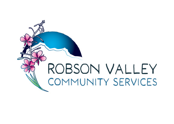
The monochromatic version of the final logo is clean and legible. The lines are all clear and you can still tell exactly what it is that you're looking at in various sizes.
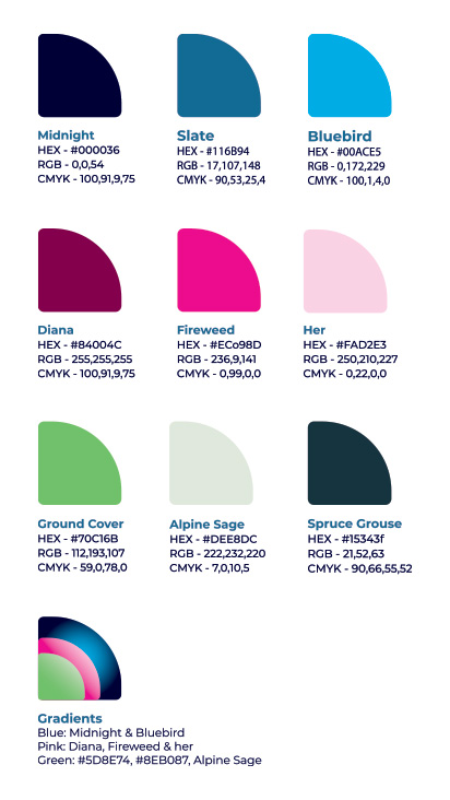
This punchy palette was pulled from the fireweed itself, and the crisp bluebird sky on a clear day at the base of Mt.Robson. These striking balances that are found in nature lend themselves beautifully to this brand, and serve as a unique anchoring point, making it feel regionally specific and accessible - traits that are both immensely important to this visual identity.
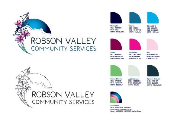
There are nine colours under this brand's rainbow, separated into primary uses, secondary and accent colours. Each of these colours has a role to play in the overall identity and came with a set of usage guidelines to ensure that there would be no technicolour overwhelm as they set forth in creating content on their own.
To round out the brand identity, I have selected a font pairing of two fonts. A blocky sans-serif “Montserrat, complemented by the warm editorial feel of “Alegreya”. Using these companion fonts in their varying families and weights allows for a broad spectrum of style choices - while remaining cohesive and visually aesthetic across the board. In fact, this body copy is set in Alegreya (regular) in 10.5 pt size! This flexible system is appropriate for digital content, print collateral, and long-form communications.
The final deliverables for this project included a full brand identity package, with logo suite and branding guidelines, and an overhaul of the existing website design to reflect the new branding.
The final logo suite included a full colour primary logo, black and white versions, a favicon and social media profile image.
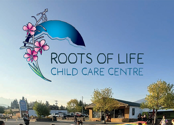
I also set up a version of the logo to be used as the logo for the organizations childcare centre. This alternate logo consists of the primary icon, with a new wordmark and some colour changes.
Once the overall brand identity was finalized, the next part of the project was to apply all of new visual identity to the existing RVCS website. The website is built on a Wordpress template, and had not been updated in a number of years, so this project included a fairly comprehensive website overhaul in order to bring the site up to speed with the new look and feel of things.
With some tweaking, new css code, and cleaning up in the backend - I was able to integrate the new branding into the website. The majority of the imagery was provided by RVCS, with the addition of some new photos here and there. A large part of this site overhaul was in formatting older content, resizing photos to fit a more modern layout and ensuring that the site's template was displaying all of the content properly. It was certainly an adventure in web design :)


