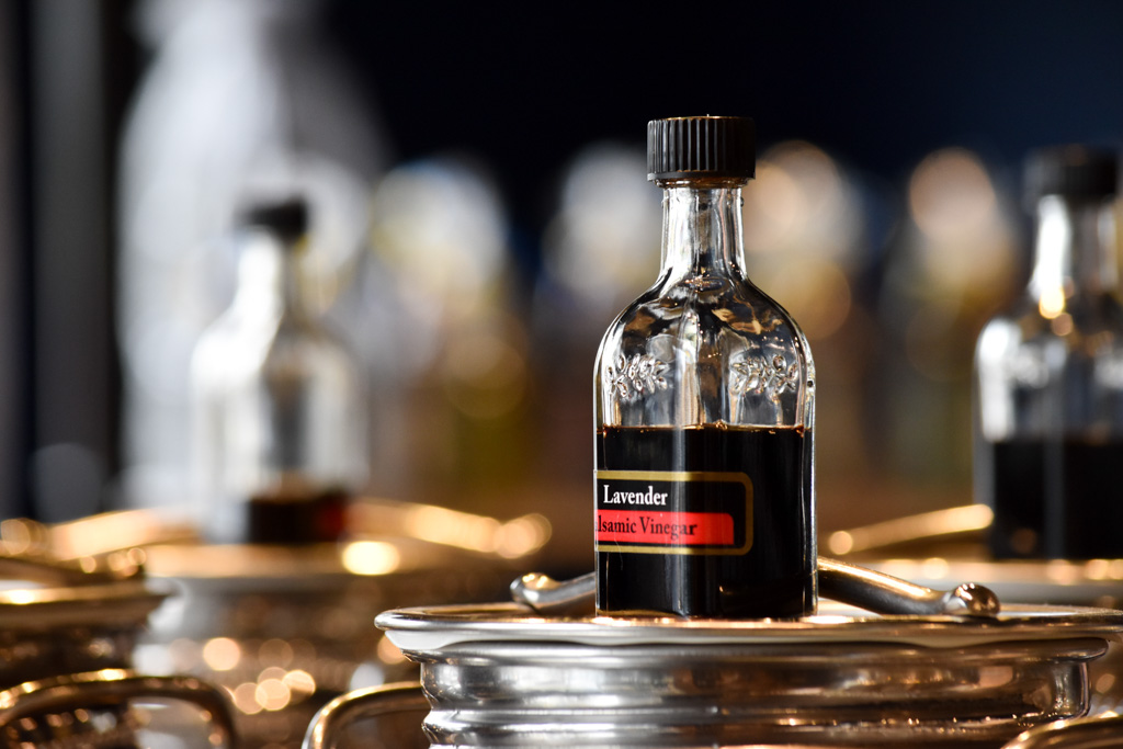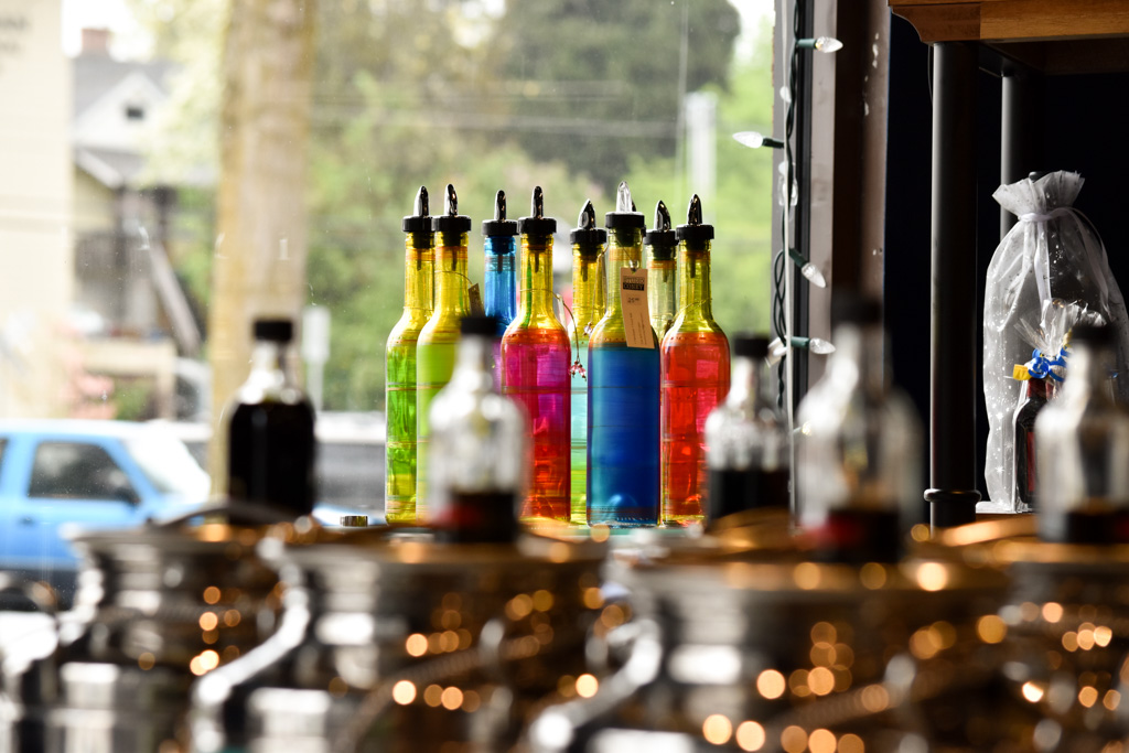
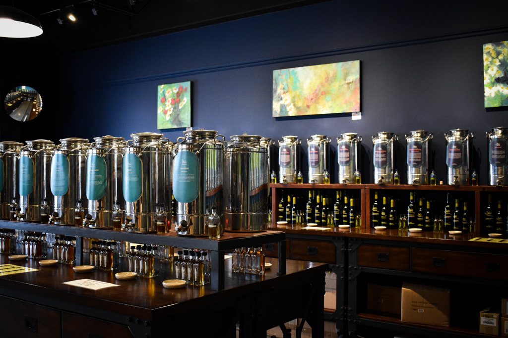
The Olive Station is a gourmet olive oil & vinegar tasting room, located in Duncan, BC. When Grant and Tammy decided to move forward with this new venture, they were starting from exactly zero. We had a clear slate - no competitors in the area, niche products, and a bare bones empty space to build out the storefront.
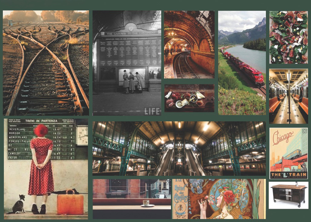
A new designer's playground. At the time, I was in my third year of university, working on my bachelor of design and working a part time job afternoons and weekends. I was busy, but ambitious to get a full brand identity project under my belt outside of school work.The goal was to build a brand that was luxurious, but humble, rooted in exploration, culinary adventure and high-quality experiences for foodies. The way it feels to sip an espresso outside of the train station in Pisa.
If you know Duncan, you know that it is completely unique. There is this cross-section of upper middle class retirees, young families, and hobby farmers. We would need to build an identity that was appealing to tourists, locals frequenting the farmers’ market, professional chefs and budding foodies. Duncan is absolutely a hub for all of these folks. The location for the store was perfect, right in the heart of Downtown Duncan, just down the street from the old train station, and around the corner from the market! All of these regional factors came into play as we worked out a name for the store and the first round of sketches for the logo. Locations, demographic, and product origins all held court in the research phase!
Our first formal meeting about the future of The Olive Station took place in the backseat of my in-laws’ Hyundai. We were driving between two prospective storefronts for the business. One in Downtown Duncan, and the other across town in a larger complex. Like many young designers, my first big job came from family. Grant and Tammy were on the cusp of starting their new business venture, and they trusted me to handle all the “design things” for their new baby. A gourmet olive oil and balsamic vinegar tasting room.
They had just finished their official training in San Francicso, learning the ropes of all things oil & vinegar, and were looking for the perfect commercial space for the business. The general consensus among the 4 of us. Grant, Tammy, myself and my husband (who was just my boyfriend back then). We all liked the space downtown. I was cozy and located where there would be foot traffic from the farmers’ market and just down from the old train station. That is when we started workshopping a name for the business.
We wanted something that felt regionally specific and spoke directly to the product. Driving alongside the old railway tracks, it just kind of fell out of my mouth. “What about The Olive Station?” It really was that simple.
That’s all it took for all of the creative juices to start flowing. Chatter about “flavour journeys” and “tasty travel” filled the car. As soon as I got home, I started building a mood board, and doodling and reading all of the training documents Grant and Tammy had brought home from Sanfransico. My duty was to turn all of these dreams and technical jargon about pressing olives into oils, into a visual story.
At that time, I was in my third year of University working towards my Bachelor of Design. It’s safe to say that my creative process was in its fledgling state. I didn’t have a branding questionnaire or survey for clients, and in this case, I likely wouldn’t have done one anyway. I was helping to develop this concept from day one with my family. They basically handed me the reins, and there wasn’t a lot of back and forth as far as building out the concept for this brand. They had a lot of faith in me...maybe too much lol
That being said, I still dedicated myself to researching and learning as much as I possibly could about the products and the people who we hoped would buy them.
After much research and a newfound appreciation for high-end olive oil and balsamic vinegars, I had established a target demographic and built a vision of an imaginary potential customer. I asked myself questions like “where does this person buy their clothes, what do they watch on TV, and how do they spend their spare time? Creating this persona was a key point in setting up what I didn’t yet have the language for: “Brand positioning.”
Our ideal customer was someone who was well-travelled, had expendable income and a taste for accessible local luxury. Someone with a wine club membership who buys imported tinned fish and rides a pedal bike along the Kinsol Trestle. The type of person who lives in the Cowichan Valley by choice, because of the natural beauty and abundance of farm stands.
My goal was to point the branding towards people who have fine taste, and appreciate the finer things, but also value a local quietness. This motive wasn’t based on simply attracting people with money. It stemmed from doing my research and learning that there are A LOT of people in Duncan and the surrounding area who fit this description perfectly.
All you have to do is spend an afternoon at the Duncan Farmers’ Market. People in Patagonia rain-gear buying sourdough bread, and $40 Gin, and lovingly carrying it home in a straw basket. A sweet cross-section of home chefs, retirees and Montessori moms.
Part of brand positioning is determining what brands already exist in the realm of your target market. What feels familiar and comfortable to them? Studying these brands both inside and outside of the Olive Stations industry helped to build a brand identity that would place it directly on the radar of potential customers. So this big question here was, what brands make people feel how we want them to feel when they shop at The Olive Station?
The answer was somewhere between Rolex and Knorr. Vast, I know, but that’s where I landed. Food that feels both accessible and luxurious. The products at the Olive Station are imported from all across the world, and of premium quality; but it’s not going to break the bank to pick up one or 2 30ml bottles of oil and vinegar. That's the sweet spot.
We wanted customers to feel like they had unlocked the best-kept secret to being a fantastic chef. The tasting room was completely free, and customers could sample any flavour that they chose - creating a sense of adventure and inspiration, and removing the limitations that a person might feel walking into a jewelry store or looking at a designer bag. This level of luxury was for everyone!

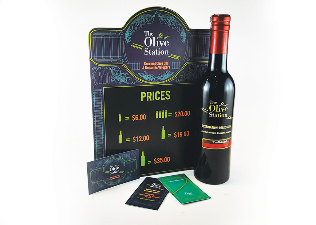
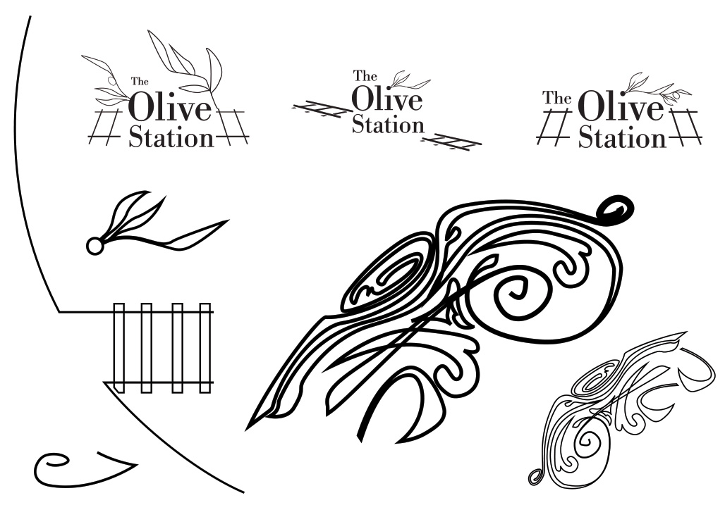
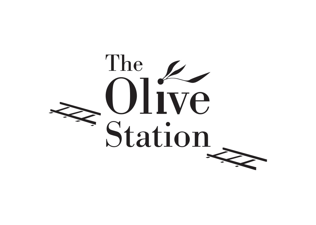
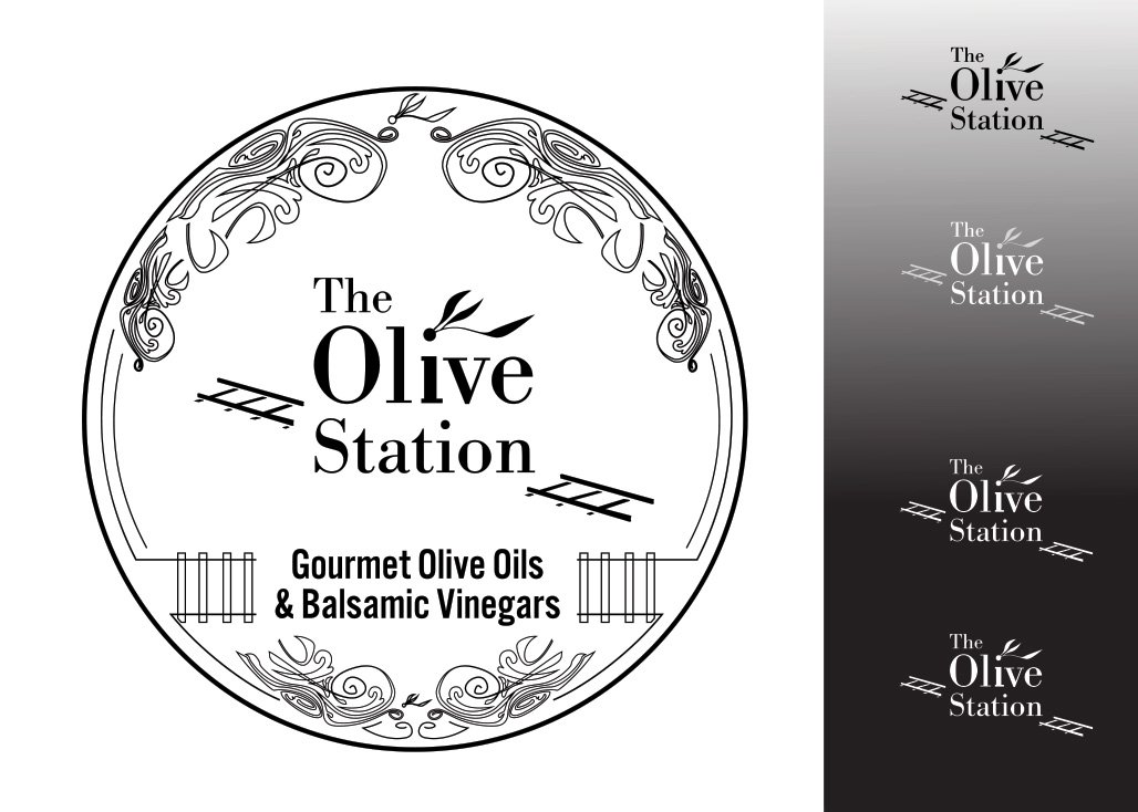
Inspiration for the logo concept came from the (Train Station) and the history of travelling by train. The process of buying a ticket and setting off on an adventure with a small suitcase. Then came the historical aspect of things. I pictured displays in vintage luggage and business cards that looked like travel documents. I loved the idea of antique clocks and Art Nouveau frames. Sipping white wine in a dining car somewhere between Pisa and Rome. I hadn’t been to Europe yet, but I was pretty sure I could capture some of that feeling.
If you know Duncan, you know that it is completely unique. There is this cross-section of upper middle class retirees, young families, and hobby farmers. We would need to build an identity that was appealing to tourists, locals frequenting the farmers’ market, professional chefs and budding foodies. Duncan is absolutely a hub for all of these folks. The location for the store was perfect, right in the heart of Downtown Duncan, just down the street from the old train station, and around the corner from the market! All of these regional factors came into play as we worked out a name for the store and the first round of sketches for the logo. Locations, demographic, and product origins all held court in the research phase!
I scribbled about 97 different little concept sketches. Olive branches, train tracks, ticket stubs and flowy Alphonse Mucha-inspired icons. I had a pretty clear idea of the elements that I wanted to include; it was just a matter of finding a composition that worked. I knew that I had a somewhat wordy name and subtitle to work with, so whatever I landed on would likely have to be on the more minimalist side of things.
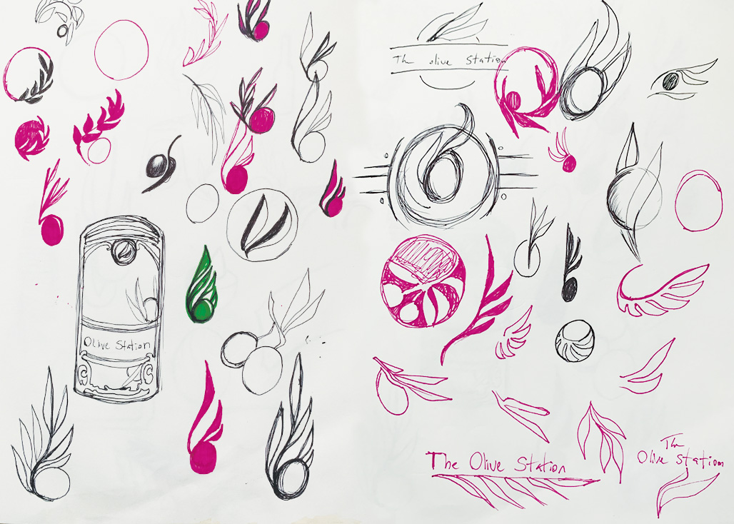
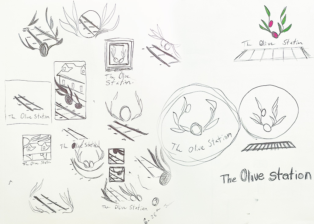
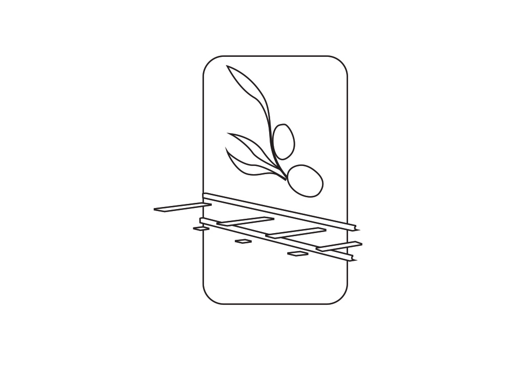
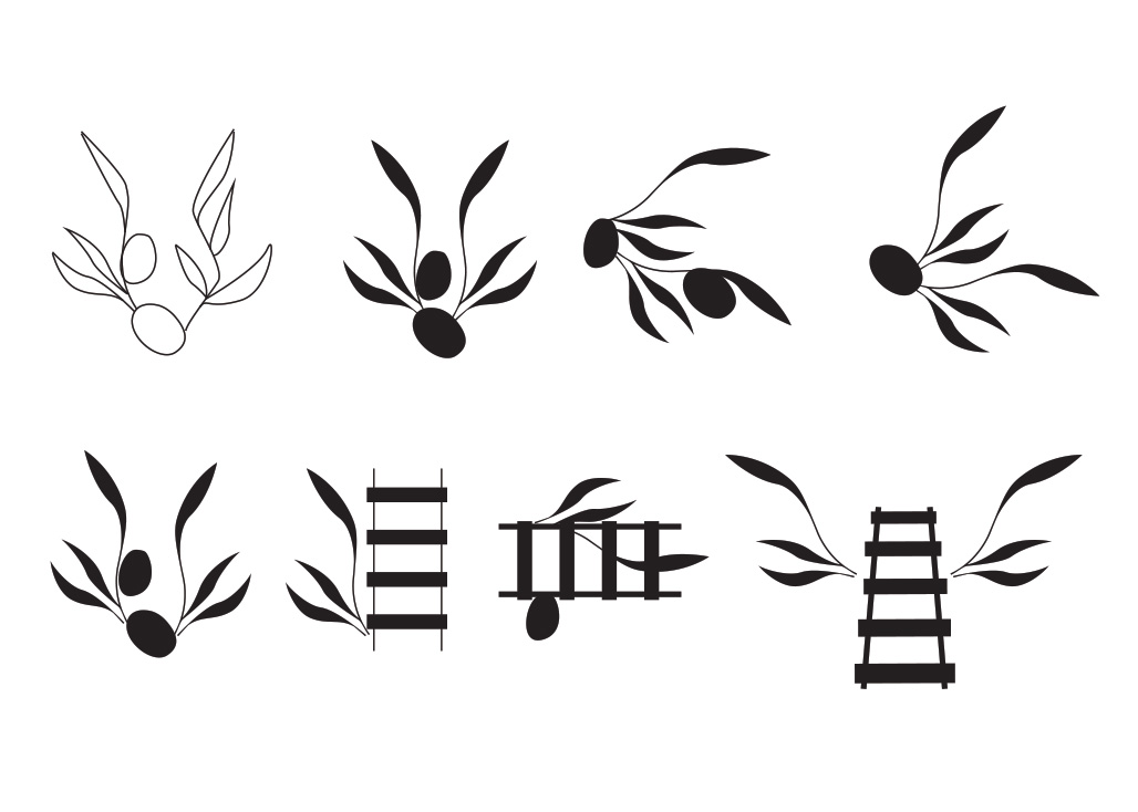
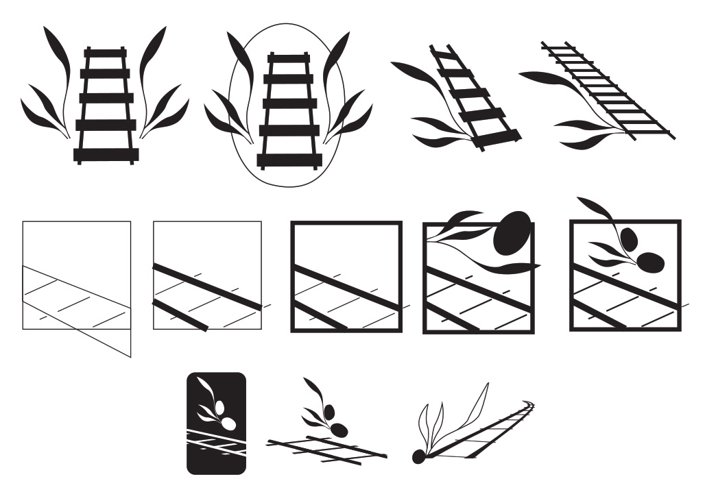
At some point in pencil sketches, you start to feel that you are on the right track (intentional train pun). I had a strong feeling about the combination of some type of olive leaf and railroad tracks. The next step was to move things into the digital realm. This is the point of the process where things move along a little quicker, thanks to copy and paste and handy shape-building tools.
I opened my digital comps for this project for the first time in 10 years, and it was a nice trip down memory lane to see how I used to work. Of course, there are so many parts of building things that I would do differently now. I’ve mastered my tools, and my workflow feels like second nature. All of the professional growth aside, this logo and its preliminary iterations still stand up, and I certainly take some pride in that :)
It was fun to look through all of the artboards for this project and see exactly how this logo progressed from scribbles to workable digital comps, like a roadmap. This project is a prime example of why process is important; after a decade, I was able to just open the files and pick out exactly which part of the process I needed to look at to write this case study - Even if I lacked the foresight to create an actual case study back then, all of the foundations were already there for me.
Black and white concepts are still king of the castle. That’s the hill I’ll die on as a graphic design purest. For this logo, I worked out a lot of the kinks in the digital comps phase. Working in B&W allows me to see areas in a logo where things might look too busy, or don’t read well at various sizes. Contrast is the key difference in a logo that works or doesn’t. It’s also one of those things the .ai generators haven’t quite perfected yet...
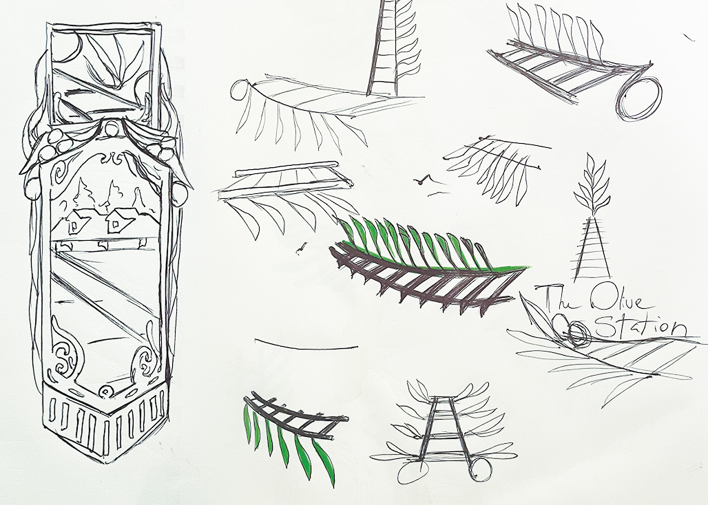
For this logo, I started by tracing elements of my pencil sketches, which I was happy with the shapes and structure of. Mainly a set of olive leaves. After refining the outline of the olive branch, I was able to duplicate, rotate and scale it to my heart's content. This part of the design process is where things really start to come together; essentially, you can explore size and composition with just a couple of clicks. It’s also where experiments with wordmarks start. I’ll often use a placeholder text in digital comps so that I can get an idea of the overall structure for the final logo.
I remember that one of the biggest challenges in making this logo was getting the perspective right in the railroad tracks. At the time, I had not yet figured out how to use perspective tools, among other things, in my design software. What would take me about 5 minutes now took a looong time back then, because I was trying to use design software like a drawing tool, which it is not.
After a lot of messing around, I was able to make a set of train tracks that I was happy with. The composition was starting to look like something, and at this point, I included a basic wordmark so that I could work out the spacing of the logo. You may notice that the primary logo is a full circle with a decorative frame and a subtitle. Things did not start out that way. The primary logo was meant to be the wordmark and the railroad tracks as a standalone. However, in practice and real-life application, I quickly found that the readability wasn’t working on its own, and began working on the alternate logo (which is now the primary)
I’ll chalk that up to inexperience; I hadn’t worked in a sign shop yet. That is where my consideration for all final design output was truly pounded into my skull.
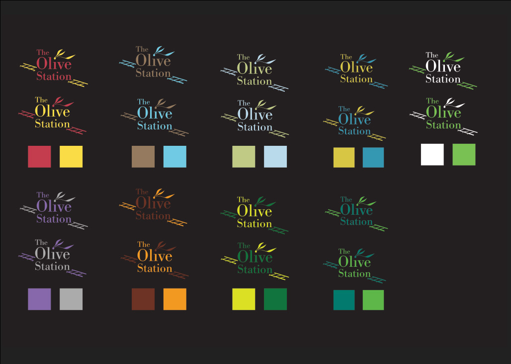
Given that I had built a solid mood board and already had a very specific vision for the brand, the process of choosing an appropriate colour palette was pretty smooth. I’ve always loved the psychology of colour theory, and as a student, I think this was an area I excelled in.
For this project, I knew that I needed a swatch that felt luxurious and artisanal with an element of antique influence. My first explorations leaned towards a warmer palette of rusty reds and creamy yellows. I also explored more natural tones of lavender, sage and even grey. None of those truly hit the mark, though. The “autumn” shades read too much like barnyard chic, while the lighter purples looked muddy and lacked punch.
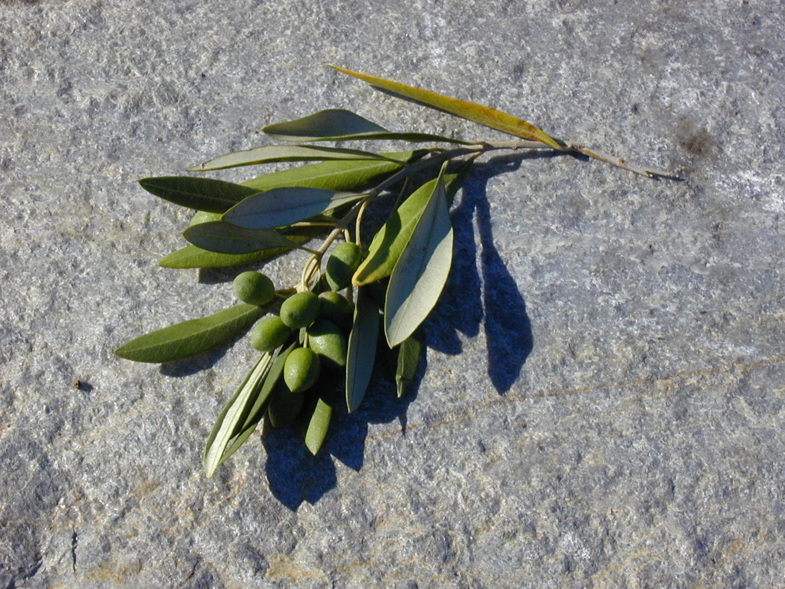
I referred back to my research into the actual products, and sampled colours from olive groves and oak barrels. That combination felt too military. I started to look at photos of the olives themselves at various stages of ripeness. The spectrum runs from a deep blackish purple to a bright yellow/green. That was the combination that had staying power and led me into the territory of very dark blue, turquoise and lime green. I added in a buttery yellow and light pink for contrast and versatility, and the rest is history.
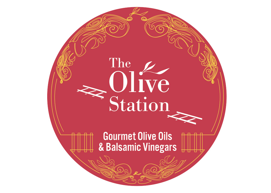
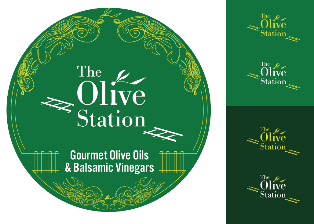
Once I had a few sketches that I was happy with, I took the concept into the digital realm. I can look back at this time in my budding career fondly. I have come a long way in the way that I know and use my tools, and there are certainly things that I would have done differently had I taken on this project 10 years later. All that aside, the logo has stood the test of time. I can thank the font choices and colour palette for doing all the heavy-lifting with this logo suite. The circular shape lends itself to mass-suitability and meant that it worked equally well as a rubber stamp and in the newspaper.
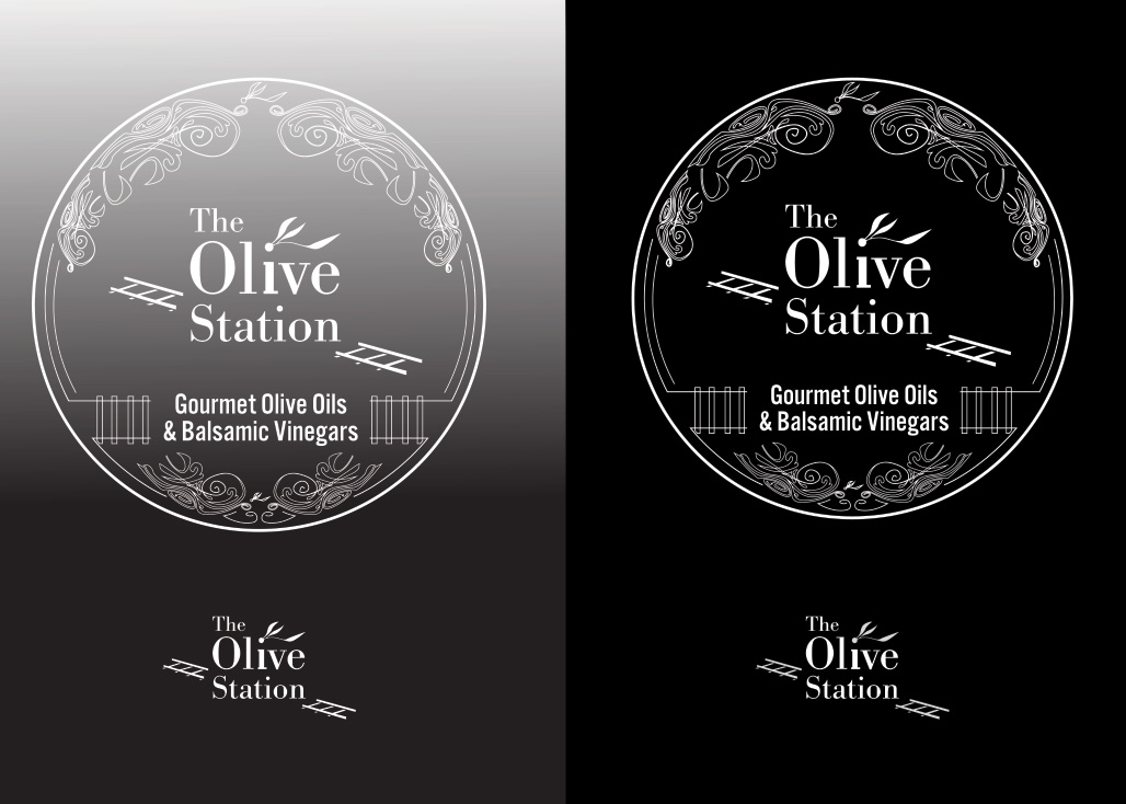
When I talk about the design process and ensuring that a logo works in black and white, I am not just saying that the logo needs to exist as a black version. That is, of course, the foundation, but the final deliverable of a black and white logo has more to it. It’s not just the logo with all of the colour removed. There needs to be a separate logo system of monochromatic logos that spans across a handful of use cases. Think laser engraving, letterhead, screenprinting and rubber stamps! Each of these outputs requires a unique setup, and so the black and white logo suite is built with these considerations in mind. Here is what you get when I say Black & white logo variations:
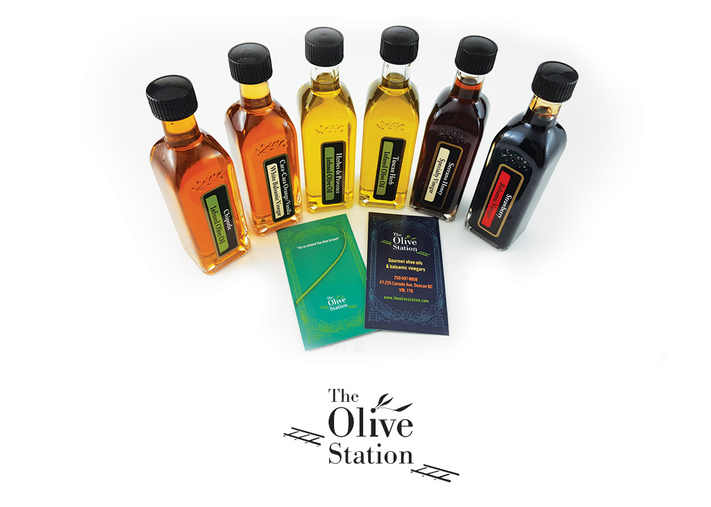
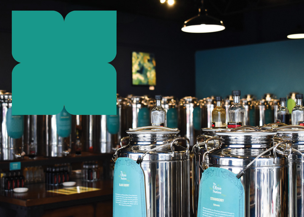
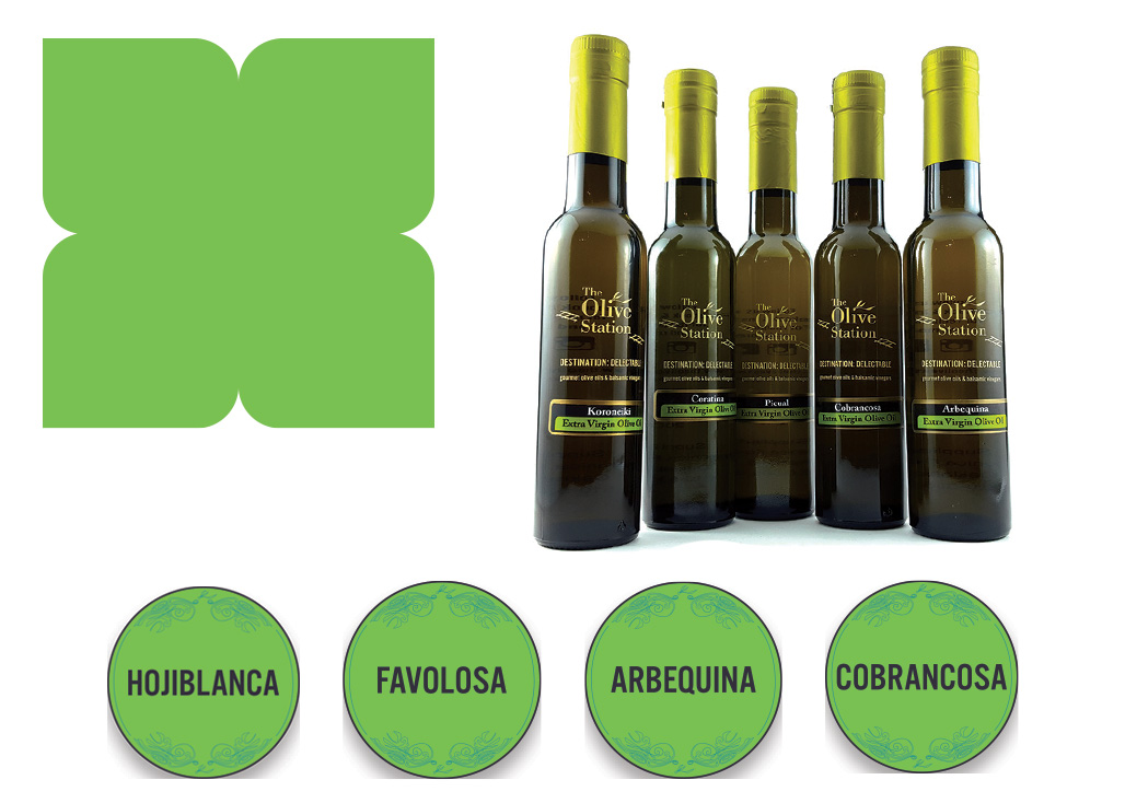
The Olive Station colour palette includes 4 primary brand colours and 2 secondary colours. The primary colours account for the brunt of the work, while the secondary choices come into play with alternate background colours, mostly in product labels and web design elements.
Dark Blue
This deep dark blue has a hint of blackish purple, somewhat like an over-ripe olive. This colour is the main colour for the brand, and is used predominantly for backgrounds across digital and print touchpoints.
Turquoise
Inspired by the world-famous “Tiffany Blue,” this colour harkens to exclusivity and luxury. It is used primarily is a background colour, notably in business cards.
Lime Green
This limey green brings high-contrast punch to the palette and is used for subheadings and grabbing attention in printed media.
Light Pink
Coral with a clay pot influence brings a playful comfort to an otherwise fairly masculine swatch.
Light Yellow
Buttery yellow enters that chat for blocks of text on dark backgrounds.
White
White is included for use as backgrounds, and large bodies of text, as well as in the primary wordmark to create contrast.

Typography is truly the backbone of a great and effective graphic design. If your customers can’t read your logo, how will they know who you are and what you do?
The font choices I made for this logo were inspired by decidedly traditional design aesthetics. A classic serif that is clean and legible - paired with a more hardy and rigid sans serif. These choices were safe and time-tested, and they are still doing a great job a decade later!
The logo is a combination of Bodoni and Alternate Gothic No.3, striking a fine balance between a gentle serif font and a more robust sans serif to do the heavy lifting. The Olive Station is set in Bodoni, whose crisp and dainty serifs guide the reader's eye left to right, for smooth, unconscious comprehension.
The subheading “Gourmet Olive Oils & Vinegars” is set in Alternate Gothic No.3. The bold vertices of this font pull your eye down from the main word mark. This pairing is a beautiful set because it follows strict subconscious rules of readability. There is no question about the hierarchy of information. For a logo with 8 whole words in it, there is no fatigue in reading it. Mission accomplished!
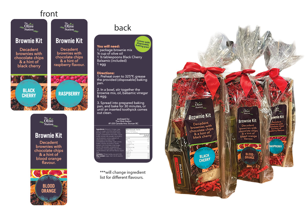
Body copy for all things Olive Station was set in Avenir Next. Why? because it reads well across print and digital touchpoints, and is easily accessible, and often free to use. That means that when you hand a project over to another designer, say someone laying out a newspaper article, they will have little to no trouble ensuring that the brand identity is adhered to. It was used for website body copy, advertisements and on the product tags for olive oil & balsamic vinegar.
Avenir Next is available in a variety of weights and was designed to be easy on the eye, performing well in both large walls of text and one-liners on a business card.
At the conclusion of the project the Olive Station was a fully sussed-out brand. The foundation of the branding was all set in stone, with a defined tone of voice, brand positioning and cohesive visuals to drive it all home. This project spanned over nearly a decade with ongoing content creation via advertisements, new products and general upkeep of the website and social media portion.
The final logo suite consists of a primary logo, an alternate logo using just the wordmark, and a “boiled down” version of the primary mark for use in stickers and packaging.
Seeing as how this project spanned over a decade, there is no shortage of printed collateral. I am not going to share every newspaper ad and social media graphic here for two reasons. Reason one, there is A LOT, reason two, some of it is trash lol
This is a case study, but I think I’d probably be doing myself a disservice as a professional by showcasing some of the truly awful layouts that I cobbled together as a new designer...
The Olive Station website, as it is today, is almost the same as when I revised the original design in 2018 (I think). The business is under new ownership as of 2025, so moving forward, there may be some changes here and there, however it looks like most of the original framework is in place and behaving as it should.
I built this site in Squarespace, and in the time between building the site and now, there have been a lot of changes on the platform. Some great and some I don’t love. One of the wonderful things about Squarespace is how easy it is to use for regular people. Teaching Grant and Tammy how to use the e-commerce side of things, like adding new products, managing inventory and updating basic text like hours of operation, was a simple and streamlined process. A task that made the handover to the new owners easy and low-stress as well.
While I no longer build new sites in Squarespace, I am still happy working on sites there, and will continue to sing the praises of its usability to clients who need a simple site that does what it’s told.
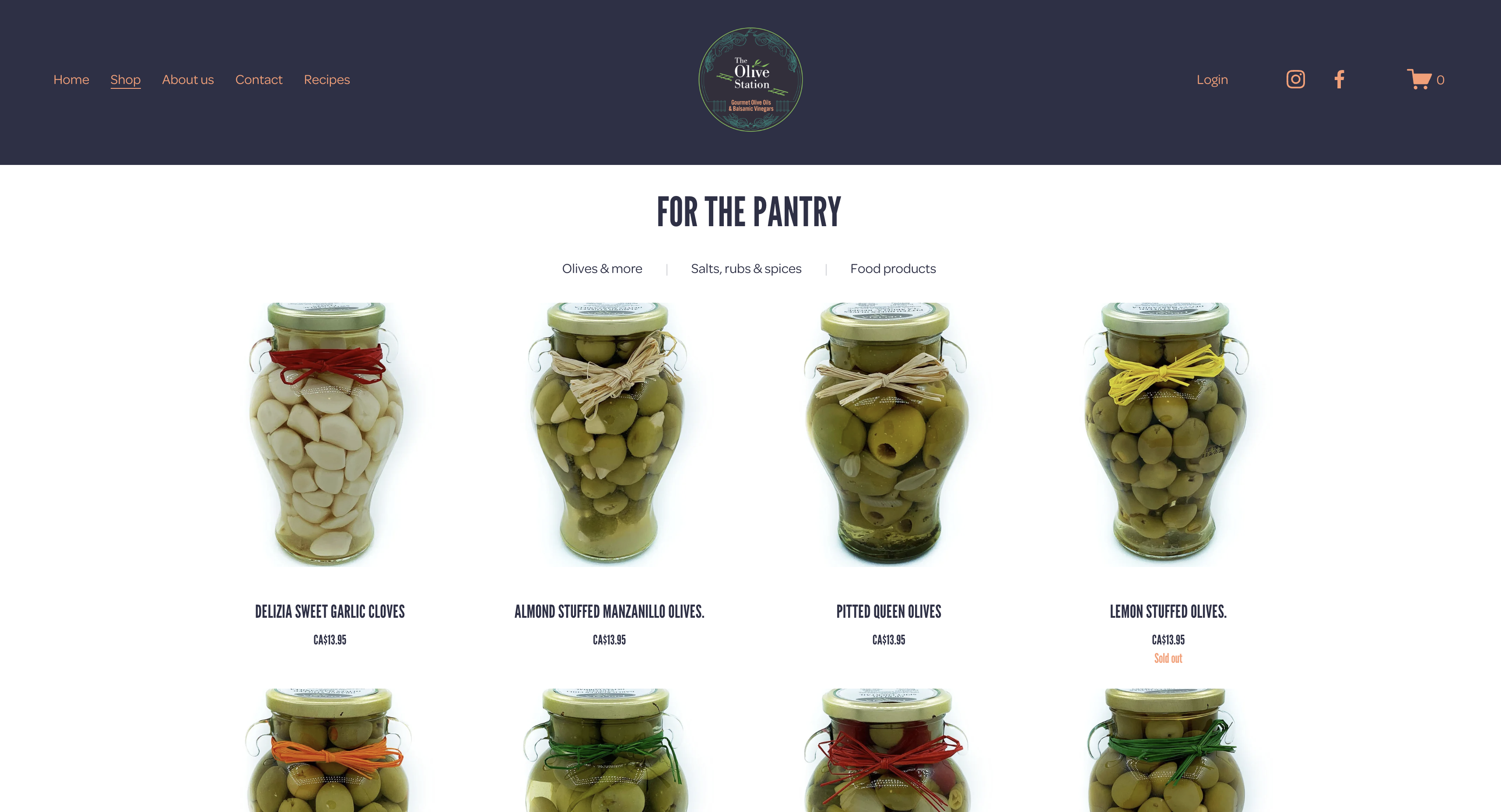
This website is a very robust e-commerce site that has a lot to say without making the user fall asleep. There is an abundance of information to include when selling food products, and regulations to follow as far as displaying nutrition information, and ingredients, and that’s just for the oil and vinegar side of things.
The website comprises 6 main pages and an online storefront. When I started this design, we had over 300 products with variations in size and price. It’s a beefy one - but the integrated ecommerce system in Squarespace certainly makes it manageable to host this wealth of information in a clear and manageable way.
The brunt of the work for building this site was in product photography and copywriting. Typically, a lot of this content would be provided to me by the client; however, since this is a family business, I handled most of this myself. At this stage in my web design adventure, I was eternally grateful for the drag-and-drop nature of Squarespace. Nowadays, I like a little more control of design and layout, but it goes without saying that this website is still a solid piece and does all of the necessary things to drive the business forward.
I swear this is not a commercial for Squarespace. Though I wouldn’t fight them if they wanted to throw me a couple of dollars, haha. This is the part where I talk about the features and benefits of the Squarespace backend. These are especially helpful for clients who are not the most tech-savvy, but still absolutely need to have a website that performs well without thinking about it too much.
Once the site was essentially finished and approved, it was time to launch it out into the ethos. With a few clicks and toggles, Squarespace handles most of the search engine optimization. Meaning your business will show up on Google pretty much right away. They also included a complimentary 1-year subscription to Google Workspace. That meant that setting up proprietary email addresses and contact forms was a simple process.
They also make connecting a custom domain simple and clear-cut. It all feels very accessible and hands-off. These were all elements of this web design project that I hadn’t mastered at the time, and I’ll always be grateful that I didn’t have to break too much of a sweat to create a final product that made myself and the business owners happy.


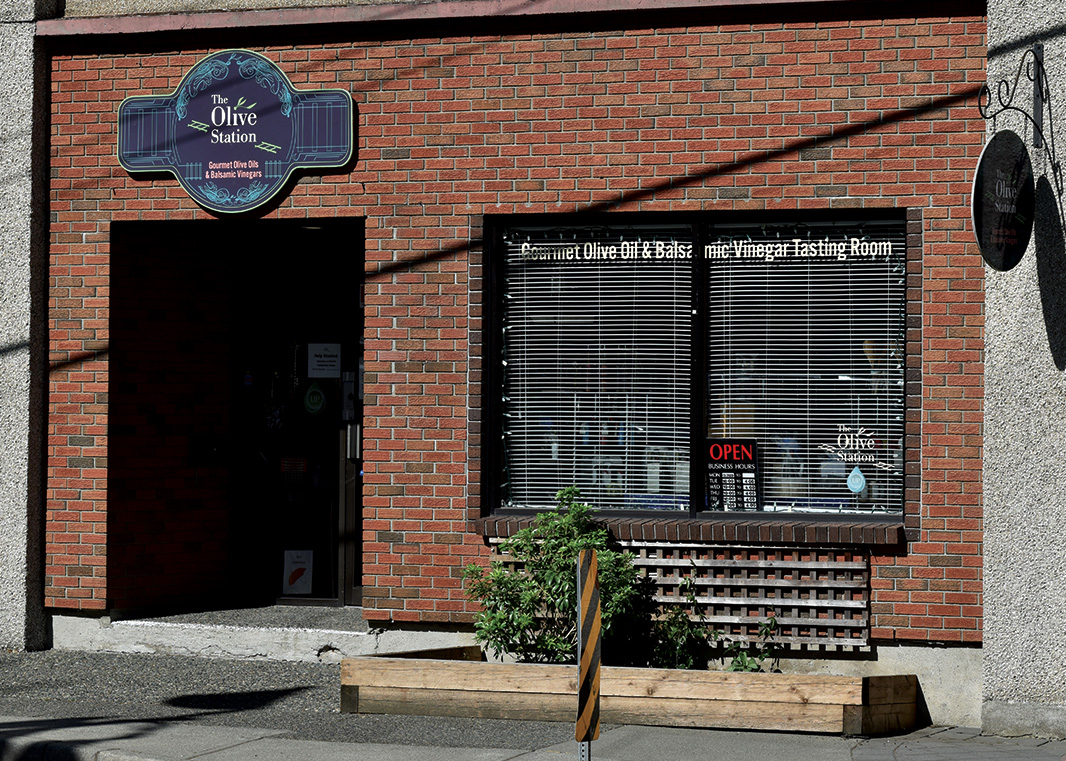
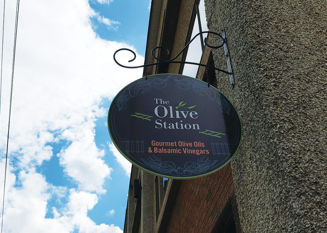
I have a biased opinion about signage because of my time served as a production designer in a large-format print and sign shop, but I will say with conviction that I think signage is the piece that makes a design project feel real. There is something about standing in front of a billboard or storefront sign that makes a business owner feel like the wheel is actually in motion.
Signage for the Olive Station included:
A large storefront sign
A hanging sign on the side of the building
Window Graphics for front and side windows
Sandwich board
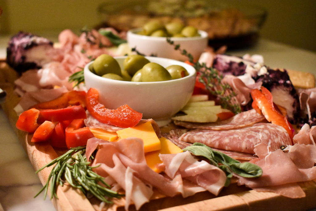
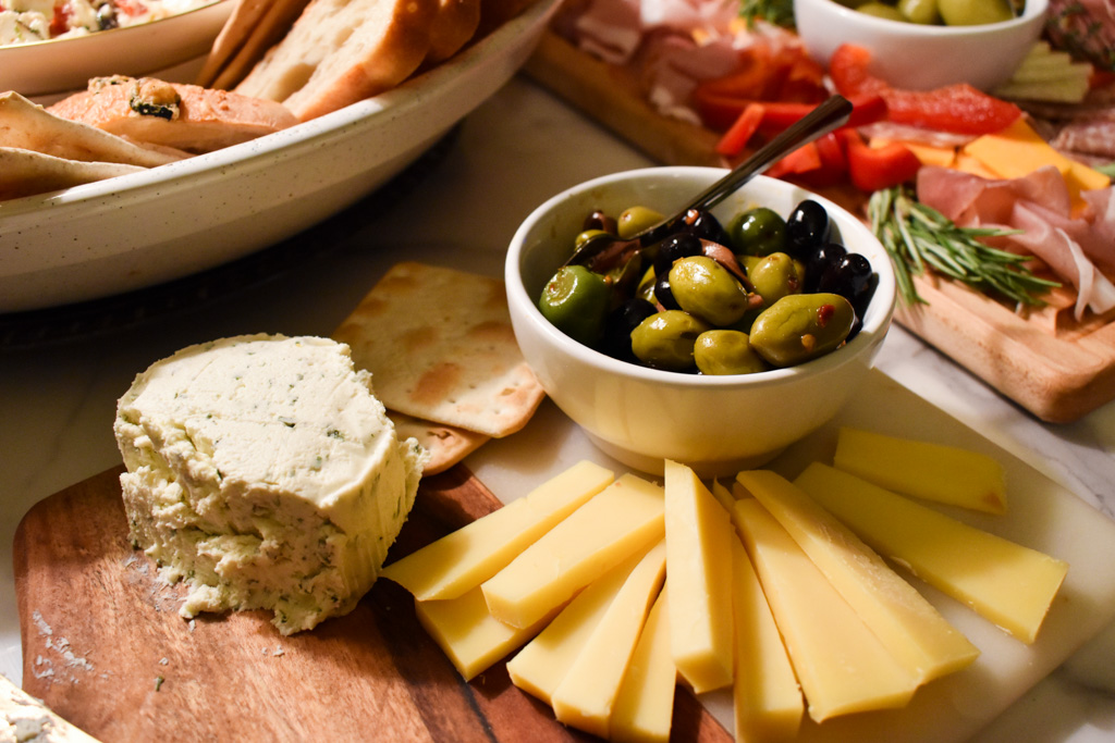
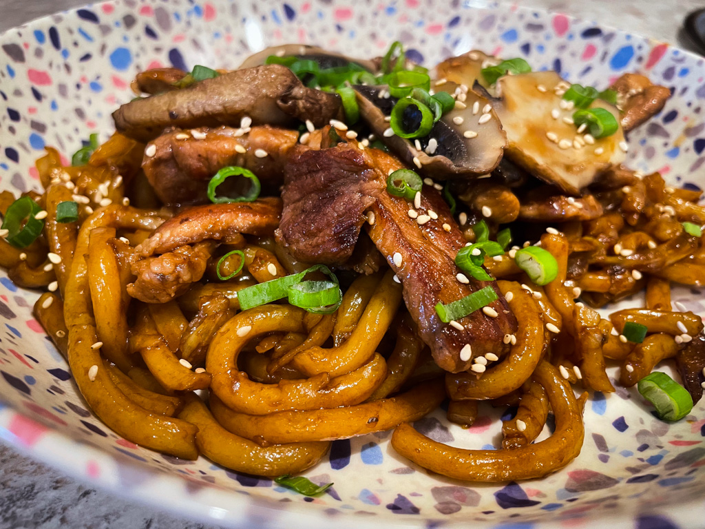
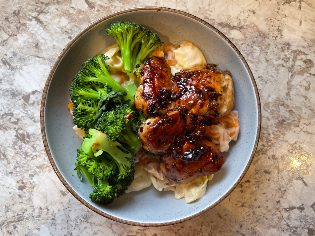
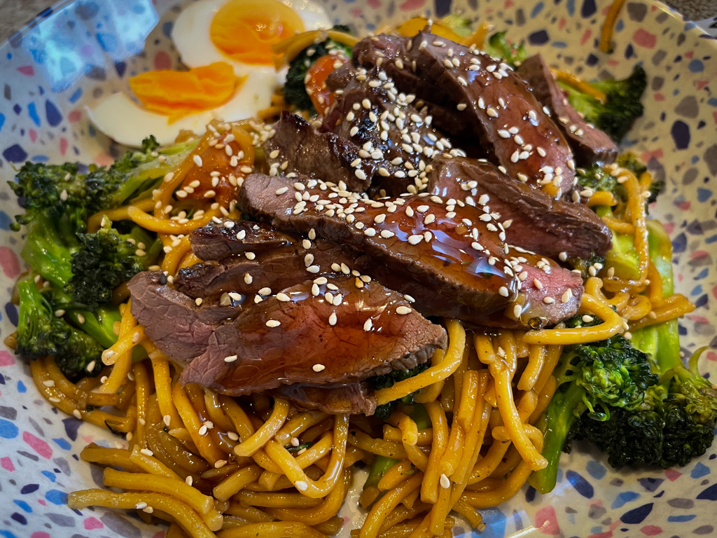
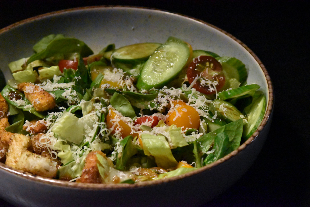
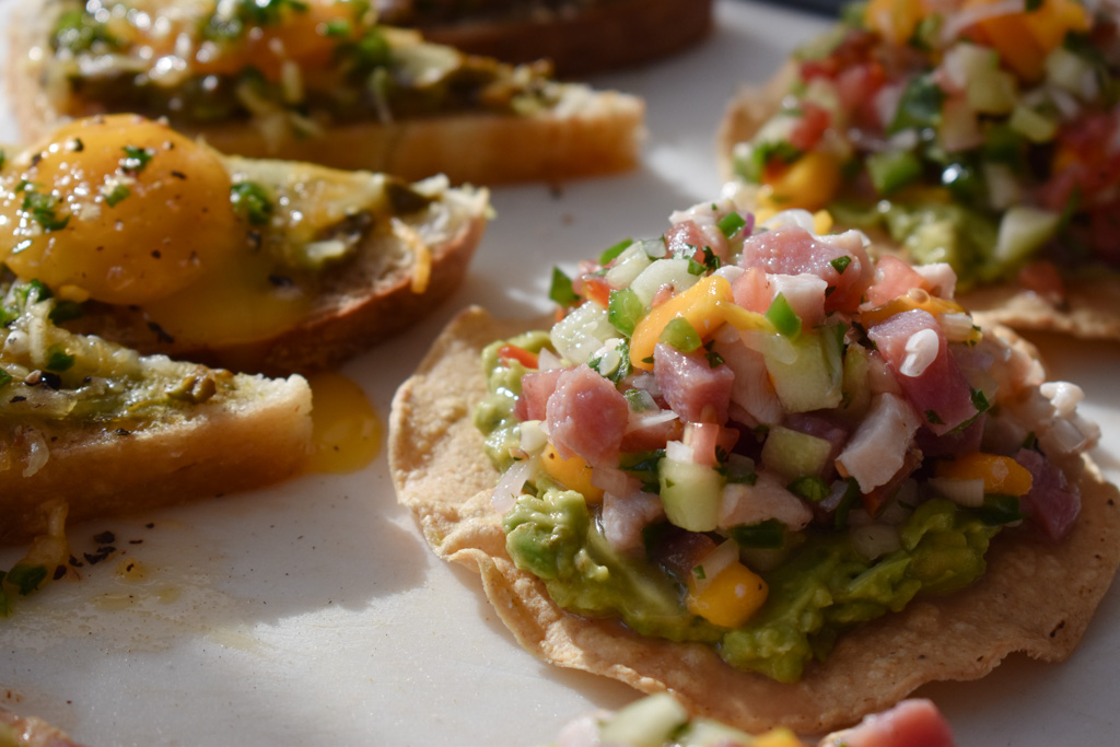
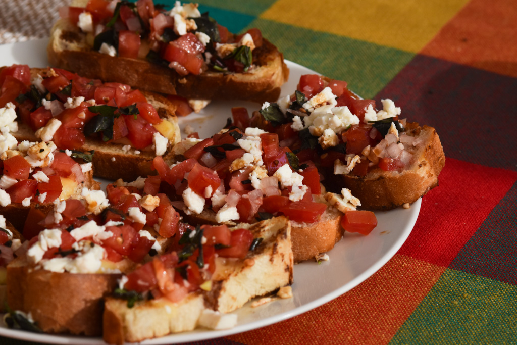
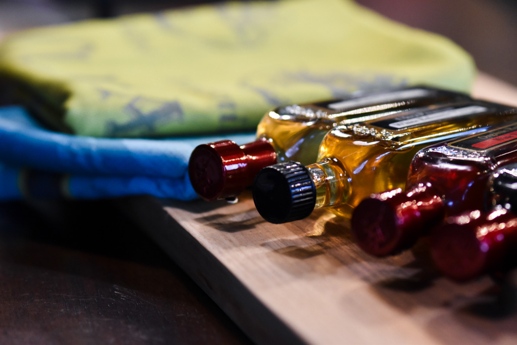
Imagery was always a key component in the Olive Stations Branding, and an element that I think carried this Identity most effectively over the last 10 years. There were very strict guidelines for the photos used throughout all of the content that was used. We started out with a mixture of stock food photos and some images shot on my old Samsung cellphone. These images were always given a quick treatment in Lightroom or Photoshop before being published - to ensure that the visual look and feel was cohesive.
Over time, I became a better product & food photographer and graduated to using a big girl camera. My trusty Nikon D3500 allowed me to shoot better photos, and that slight elevation in gear meant that the images used for The Olive Station looked more professional and polished. There was the added benefit of becoming a much better cook! I had infinite access to premium olive oil and vinegar after all.
Photos utilized natural light, clear contrast and dark shadows. It’s important when photographing food that the colours remain true, and the saturation doesn’t become cartoonish. A good spaghetti sauce does not have to be bright red to look delicious :) The goal was always for food and product to look appetizing, Instagram-worthy, and achievable for a home cook.
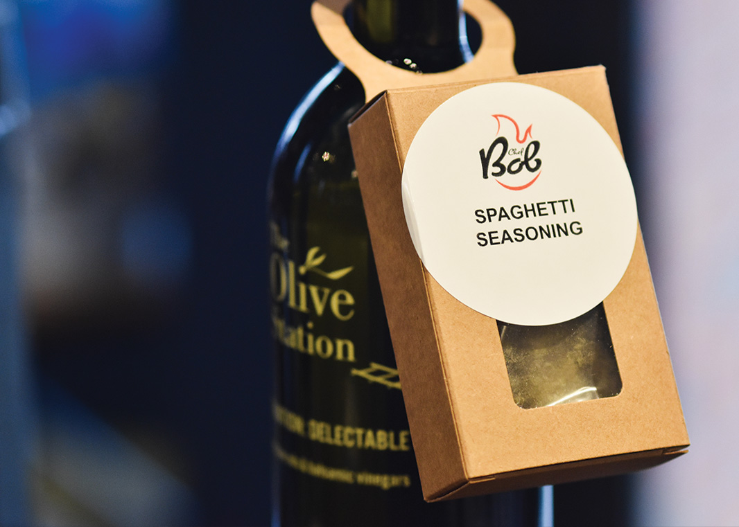
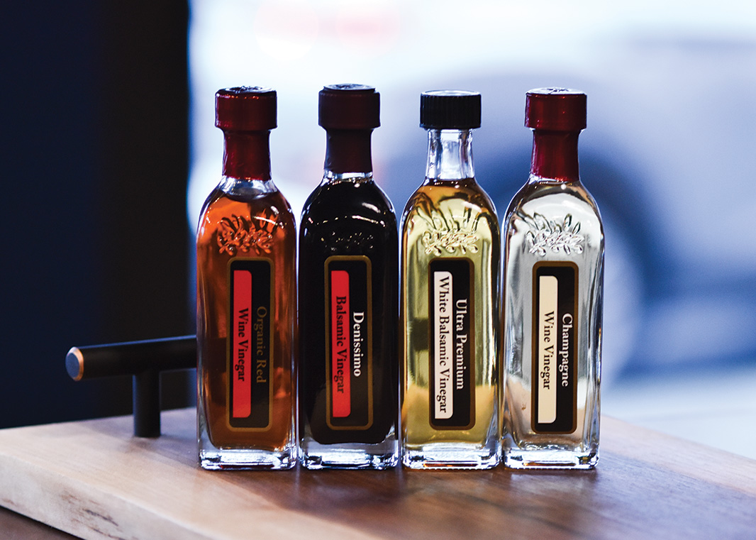
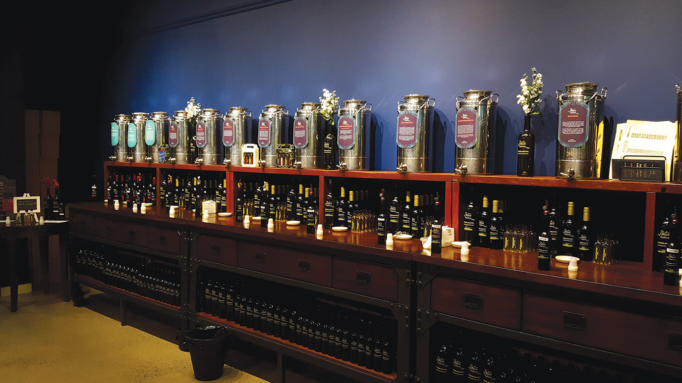
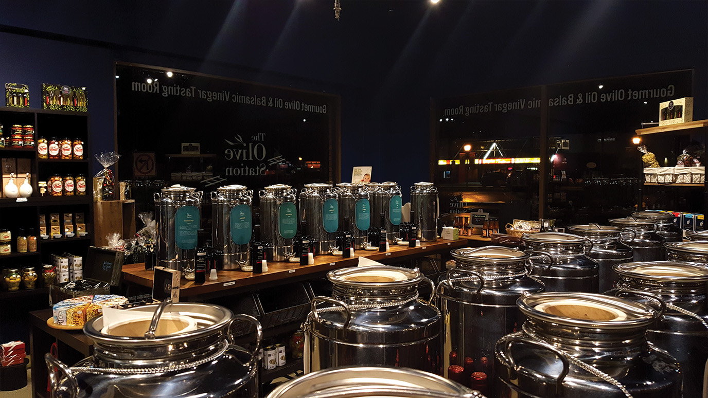
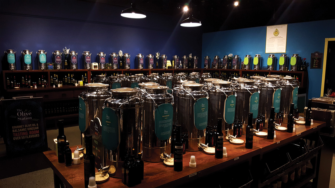
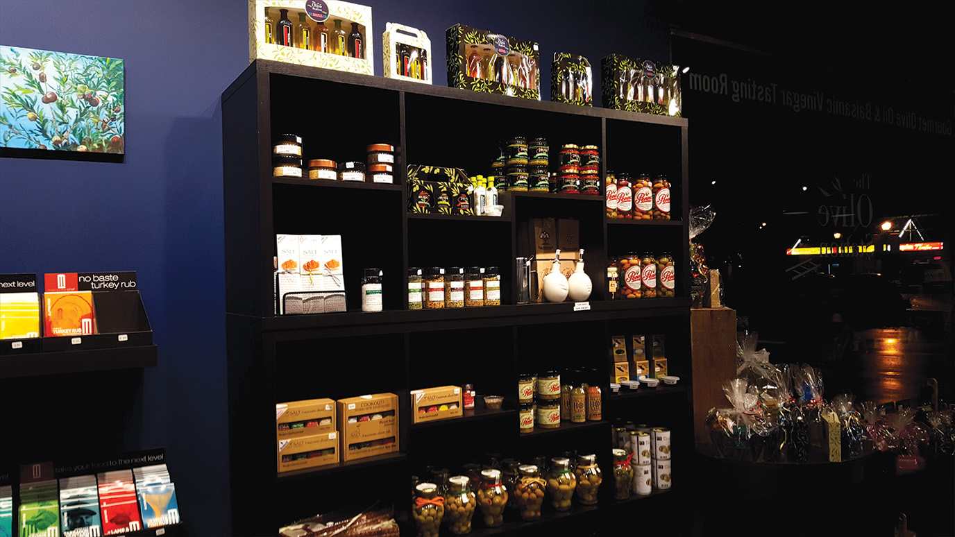
Along with imagery of food, there was the integral element of product photography. It was of the utmost importance to showcase the products and storefront in a way that told customers exactly what we sold. We knew at the start of this business that people might be confused about what this place was. Is it a restaurant? Do you sell food here? What is this place?
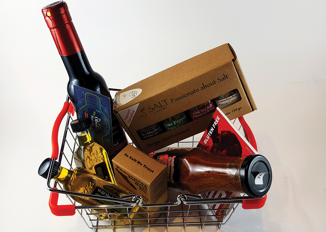
With that in mind, while we soft-launched the business, I spent a great deal of time building a mini “light box” so that I could shoot photos of bottles, spices, jars of olives, soap and dishes. These product shots were eventually expanded to include all of the product imagery used on the website.